
July 10, 2015

Calls-to-action (CTAs) are an integral piece of every marketing campaign. And a well-designed and placed CTA is key in getting your audience to click and convert, or at least take the next step. So what does a good one look like? Take a look at these examples that are unique, interesting and highly clickable.
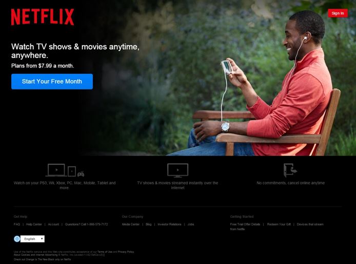
1. Netflix's Compelling Offer
Netflix is an on-demand media streaming service. On Netflix.com's homepage, visitors are immediately greeted with their value proposition (the ability to stream TV shows & movies on-demand) along with strong visuals of people enjoying Netflix programming via mobile devices. Reader’s eyes are immediately drawn to the contrasting blue button with a compelling offer that tells the reader what to do next – start a free month of service. There’s a secondary CTA on the right for current Netflix customers as well as some subtle links at the bottom of the page, but the path for first time visitors is clearly intended to get them to sign up and start exploring Netflix services.
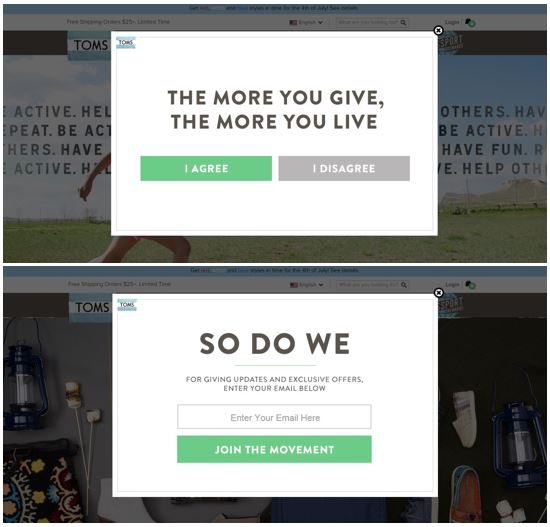
2. TOMS' Thought Provoking Question
Getting site visitors to sign up for email subscription can sometimes be tough, but TOMS has an interesting approach. Before asking visitors to subscribe to their emails, TOMS, a company that designs and sells shoes, first asks a thought provoking question that’s reflective of their brand and value proposition. For every pair of shoes sold, TOMS gives a pair of shoes to an impoverished child. So when site visitors are asked if they agree to the statement “The more you give, the more you live” (and the visitor agrees) it’s a clever segway into asking them to sign up for related updates and exclusive offers. And, instead of simply asking readers to subscribe, TOMS asks them to “Join the movement” - which is more enticing and interesting.
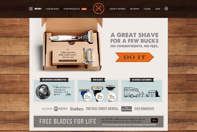
3. Dollar Shave Club's Humor
Dollar Shave Club offers a monthly service of delivering razors and personal grooming products directly to your mailbox. Dollar Shave Club's homepage also leads off with their value proposition (A great shave for a few bucks.) The bright orange CTA button grabs the reader’s attention and the arrow-like shape suggests moving forward to the next step. Dollar Shave Club’s brand is very humorous and interesting (see their YouTube channel), so the direct approach of “DO IT” as the copy on their CTA button follows that humorous tone.
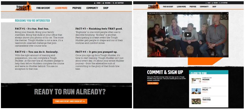
4. Tough Mudder's Inspiration
Tough Mudder is a 12 mile long military-style obstacle course held in several locations across the globe. The event is designed to build comradery through fear-based mental and physical challenges such as running through live electrical wire, jumping from tall heights and crawling through confined spaces. The CTA's relate with site content, which is meant to inspire people and challenge them to sign up. Each CTA uses large typeface and a bright orange button to catch the reader’s attention. Each CTA also uses strong, action-oriented copy surrounded by inspirational quotes, photos and video that entice visitors to commit and take the next step by finding an event, signing up or preparing for the event. No matter where you are on the site, the CTA’s naturally lead you toward signing up.

Refine your inbound marketing efforts with:
The Ultimate Guide to Inbound Marketing Personas


Other insights you might like