April 8, 2019
They say “beauty is in the eye of the beholder,” but if that were completely true, designers would have an extremely difficult time producing communications with any certainty of results. Everything would be a shot in the dark.
Although communication design is not an exact science, an understanding of human psychology and how people respond to core design elements can ensure that your design is on target and achieves the desired effect. In many cases, when materials are designed well, an audience will consume the information and perform the desired action without noticing the design. I know that’s a tough pill to swallow for many designers, but you don’t want your design to stand out for the wrong reasons.
This blog will touch on three core design elements that are influenced by psychology—color, typography, and layout. Future articles will dive deeper into each of the topics.
Color
There are numerous books and articles on the psychology of color, and they are all basically consistent with their interpretations of color. Red is a powerful color to denote excitement or urgency. Blue is a soothing color used to represent trust and dependability, while green commonly indicates growth and health. Most of these connotations come from universal human connections: blood is red, water and the sky are blue, plants are green.
But there are several other factors that impact how we perceive specific shades of colors. For instance, color palettes are largely influenced by cultural trends. The fashion industry is one of the strongest definers of how we relate to color. This was infamously captured in the film The Devil Wears Prada when Meryl Streep’s Miranda Priestly educates Andy (Anne Hathaway) on the history of a particular cerulean sweater. The interior design industry is not far behind with its influence on color. Am I aging myself by admitting I grew up with an avocado green refrigerator?

Pantone’s 2019 color of the year is Living Coral. Credit: Pantone®
These industry color trends slowly accumulate to define entire eras. The muted earth tones of the ’70s, the fluorescent neons of the ’80s, and the deep jewel tones of the ’90s were all embraced during their time even if they are viewed with nostalgia or disdain now. Understanding both color theory and color history, as well as staying abreast of today’s trends, can help ensure that you’re selecting the best colors and hues to reach and captivate your audience.

Typography
Like color, typography and more specifically, typefaces, can form strong psychological connections with your audience. Serif typefaces are usually regarded as traditional and classic stemming back to the earliest days of Gutenberg’s press. Sans serif typefaces are considered modern and fresh. As with color, font trends can greatly influence your audience’s reaction to the design.
A recent example again involves the fashion industry. Many long-standing luxury fashion brands have been launching new logos with heavy sans serif fonts to mixed reviews. While some argue that the brands are throwing away history to jump on a bandwagon, others defend the need to modernize with the times.
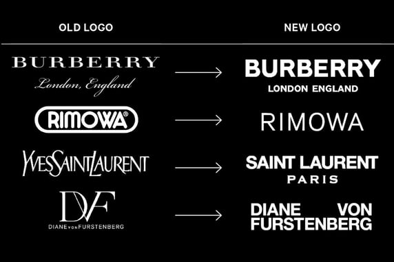
Credit: Bloomberg
But just as these fashion brands are embracing the sans serif, we may be seeing a new trend emerging with Chobani’s rebrand utilizing their custom typeface, Chobani Serif, and MailChimp’s use of Cooper Light for their new identity. Proving how important it is to know your history, both typefaces pay homage to the rounded serifs popularized in the 1960s and ’70s.
In addition to selecting the right fonts, some general rules of thumb to ensure your typography doesn’t psychologically offend include:
- Limit the number of typefaces used. Two is appropriate, three maximum.
- Use different weights—light, regular, bold—strategically for emphasis.
- Pay attention to kerning (the individual spacing between letters) and line spacing for comfortable reading.
- Avoid the temptation to use kitschy or whimsical fonts. (I’m looking at you, Comic Sans).
Layout
The psychology of layout design can be a lot less subjective or trend-based. There are documented studies and research that show how people consume information and provide best practices for layout design. One such standard is the Gutenberg Rule, which separates any layout into four quadrants emphasizing the Z-pattern that is made by the eye as it scans a page.
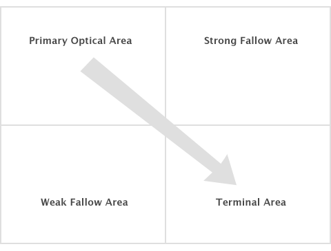
The Gutenberg Diagram
The upper left quadrant is the starting point and should contain a strong call to action. This is why logos and strong headlines are usually placed in this area. The second most important quadrant is the bottom right called the terminal area. This region should reinforce the call to action and clearly provide buttons or links or conclusion statements. Of course, this applies primarily to languages consumed in a left to right, top to bottom order. Users accustomed to languages that are read in a different direction such as Arabic or Mandarin will interact with the content differently.
Elaborating on the importance of how the eye scans a page, it is important not to place elements on the layout that lead a viewer off of the page. For example, if you’re using an image of a person looking to the right edge of the image, don’t place the photo on the right side of the layout. Readers will follow the gaze of people (or animals) featured in the imagery, so you should adjust the layout to ensure a reader is led back to the content.
Design with Intention
A final comment that can apply to color, typography, or layout is to be intentional with your design. If you intend something to be centered, make sure it is truly centered. If it’s supposed to be off-center, make sure it doesn’t look like a mistake. Similarly, if you are introducing a new color or font into the design, do it with clear intention and purpose. Ask yourself what design problem that choice solves. Don’t add elements simply for decoration. Make sure they have a purpose within the design.
If you know your audience and understand how they will psychologically relate to your design, you can greatly increase the success of the design making it more likely to elicit the response you want.

What really makes your customers tick? Find out with:
The Psychology of Inbound Marketing


Other insights you might like