4 Ways to Analyze Your List Performance in HubSpot
February 25, 2015
By Andrew Macey

Lists are an integral part of any company’s contact management. Segmenting your database leads to more effective email campaigns, lead nurturing workflows and an overall better understanding of your leads. Many companies use lists to differentiate between qualified and unqualified leads, whereas others are used to separate contacts by location or persona. Whichever way you choose to use lists, analysis of their performance is very important. Sales and upper management can see how fast certain lists grow, using this data to forecast future months, where marketing can identify the sources that are most effective in generating leads. Recently, HubSpot has added performance analysis to the list tool, giving users a detailed breakdown of metrics.
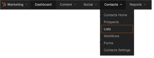
When selecting a particular list within HubSpot, there is now an option labeled ‘performance’ on the left side of the screen. This opens another area of the tool that gives a graphical approach to the contacts within. With this new data, we can now look at our list performance in 4 distinct ways:
1. List Growth over Time
The first piece of data we’re introduced to in this new tool is centered around list growth. We are presented with a line graph showing the growth of contacts in this list over a certain timeframe. Like most reports in HubSpot, you can adjust the timeframe in the top right corner to get a more long-term or short-term view. As we know, the total size of a list only tells us so much. It’s important to be able to see at what rate this lists grows, if there’s any seasonality to this growth, and use this data to extrapolate. Depending on your list, sales and management may find this data especially useful when planning for the next quarter or year.
2. Contacts Breakdown by Source
In addition to list growth, it’s important to see where the contacts in this list originally came from. If we’re looking at a list of qualified or unqualified leads, this data can determine which sources we should continue to invest in or which initiatives prove to be less successful. When looking at the second half of the list performance screen, we can select “sources” from a drop down in the right corner. This will adjust a pie chart and show which sources contribute to list membership with totals and percentages. This graph can be the basis for many adjustments to one’s marketing plan. If we find that particular sources are not contributing many contacts, however we spend ample time and money in that direction, it might be time to reconsider or try a new approach.
3. Breakdown by Country
Using the same chart as the source breakdown graph, we can select “country” as the analysis point for the pie chart. As one would expect, this will show the breakdown of contacts by country. Using this data, sales and marketing could identify new locations to run campaigns in or do targeted outreach. Additionally, this could present some additional opportunities for content or blogs in other languages on the site.
4.Breakdown by Lifecycle Stage
This graph shows the percentage of contacts in this list based on lifecycle stage. Depending on the list criteria, this graph may contain contacts of one particular stage or a variety. Understanding where in the sales cycle your contacts are can generate new ideas for lead nurturing campaigns. Noticing that many contacts are early in their buyer’s journey, we can create targeted workflows to help push them further down the sales funnel.
Using this new performance analysis tool, we can further report on the success of our marketing efforts based on certain metrics. Understanding how quickly these lists are growing or where in particular these contacts are generated from, gives a great deal of insight into the health of our contacts database and can identify new opportunities for additional marketing campaigns.

About the author
Andrew Macey was formerly the Director of Sales at SmartBug and is a HubSpot alumni. He has more than 5 years experience in inbound marketing and is a graduate of the University of Vermont. Read more articles by Andrew Macey.


-2.png?width=800&length=800&name=Blog%20header%20image%20(1)-2.png)