
5 Latest Website Redesigns We Like in Tech and on Desktop
November 8, 2018
By Kevin Coll
I know what you are thinking. It's time to redesign the company website but you don’t really know where to start or what path to go down. Taking on a website redesign project can feel daunting because it means getting more than a new look. It’s about revamping your company’s digital storefront and giving your website visitors exactly what they are asking for when they need it.
There are a lot of ways to approach redesigning your website. There is the Growth-Driven Design (GDD) process, which focuses primarily on building launchpad websites and then gathering data to strategically expand and update them page by page and template by template. At SmartBug, we tend to do things a little bit differently by taking a scientific method approach to GDD and Conversion Rate Optimization (CRO). Nevertheless, a website redesign always starts with your data and the demands that visitors are communicating to you with their traffic patterns. The second thing to incorporate into your website redesign process is an investigation of how other brands in your market space have approached their redesign project in order to get some creative ideas on style and so forth.
Here are five website redesigns that have hot new looks in the world of tech.
Tempo Is Now All About the Jira Connection
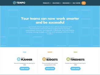

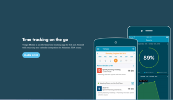
Looking at Tempo’s website back in 2017, their homepage and messaging was very different from what it is now. 2018 brought them a bright new look. They removed the blue header and shifted the messaging focus to being a Jira-specific app. They also feature an above-the-fold image promoting their new UI/UX for the application. What makes this website redesign one of our best in tech is that it is a great example of learning from past experiences. The “Try Now” CTA is now smack dab in the middle of the hero image, allowing the visitor a clear call-to-action right up front. The older design featured a call-to-action that was small, up in the corner, and below the fold. This new design establishes three critical new user experiences for the brand:
- A clear call-to-action
- Better, more focused messaging that explains what they do and how they benefit the user
- A better process of guiding visitors through the product and features without ever leaving the homepage

Adobe, the Grand Designers, Go for Subtlety in Website Redesign
For a company known for creative design software, Adobe changes their website a lot and features some truly amazing designs. What I appreciate most about Adobe redesign methods is their subtlety. Subtlety is one of my favorite things about GDD. The process of testing and learning to improve performance sometimes leads to big, grand changes for a homepage that are not needed. It is almost better to move some focal points around to coincide with a seasonal message, allow more focus on where the visitor demand is, or provide some personalization where there hadn’t been before.
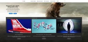 Here is Adobe’s homepage design from June. It features messaging and a design focus on “Everyone’s got a dream,” and pushes visitors to a business or individual version of their photoshop platform.
 In August, they flipped the script a bit and put their secondary message from June regarding experienced-based design into the new hero spot for the website, focusing visitor attention on using data and design to create amazing customer experiences.
Droplr Puts Pricing Right Up Front
Droplr, a communication tech tool for screen sharing and annotation, did something I’d like to see more tech companies test, which is lead with the pricing model right out of the gate. This way, visitors know right away what your product costs. The value of incorporating this into the redesign is your heatmaps and site behavior can really show how your web traffic reacts to your pricing model. Droplr also traded in some darker colors for a walk on the light side. They abandoned their navy blue homepage for some white, gray, and purple. I, for one, always take the light approach because typefaces seem to look better on lighter backgrounds and lighter websites tend to feel more inviting.
.png?width=512&name=unnamed%20(1).png)
Batchbook’s Video Is What Really Matters
Video is a powerful storytelling device in the world of content marketing, but brands often struggle with video placement on their websites. Should we link out to it? Use a lightbox? Where does it need to go in the buyer’s journey and user experience of the website? In the world of tech, you have tons of features and reasons why your product deserves the attention of someone. Batchbook decided on a digestible video to tell its story. Instead of littering the homepage with tons of product imagery like they had before, they used a video to provide visuals of their product.

.png?width=512&name=unnamed%20(2).png)
Rutter Networking Technologies
This is a website redesign done by our SmartBug creative and web development teams. The previous version of the site for Rutter Networking Technologies (rutter-net.com) faced a lot of challenges in sharing the company’s key benefits while giving web visitors a more guided path to connect with the company. It was also not very inbound friendly for posting offers and other conversion paths. The redesign of the site focused on allowing the UX to be more palatable to visitors arriving to the site so they wouldn’t burn a lot of brain power figuring out what Rutter Networking Technologies was offering and how it would benefit them and address their pain points.

.png?width=354&name=unnamed%20(3).png)
Amaury Salas
%20(1).jpg?width=120&height=120&name=sbm_2018_5.0_About_Team_Kevin1%20(2)%20(1).jpg)
About the author
Kevin Coll was formerly a Marketing Strategist at SmartBug Media. An energetic, multi-faceted, and trusted marketing professional and communicator with 10 years experience in B2B and B2C helping companies communicate and market more effectively so their customers will act. When not marketing he is exploring his love of writing screenplays, developing short film projects and hanging with his wife and friends. Read more articles by Kevin Coll.


