5 Landing Page Best Practices for Image Selection
October 11, 2012
Following landing page best practices will help you convince a user to purchase your product or service. In fact, a good landing page can convert 50% of its visitors into qualified leads, while a poor one will convert less than 1%, says David Meerman Scott, author of Inbound Marketing: Get Found Using Google, Social Media, and Blogs.
There are many elements that go into developing a successful landing page, and choosing the right imagery is one of the most crucial aspects of that process. Heres some basic advice to help you find the perfect images for your landing page and increase your conversions:
1. Project Professionalism:
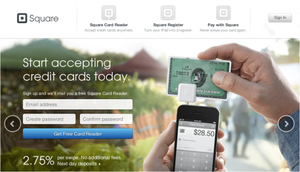
Your landing page needs to look professional, because a poorly designed page may raise concerns in your visitors mind about your company, product or service. Your images need to convey that your company is reputable and trustworthy because trust is required to convert your visitor into a lead. Squareup does a great job with a very professional feel. Using industry respected logos adds to that.
2. Choose Eye Popping Graphics:
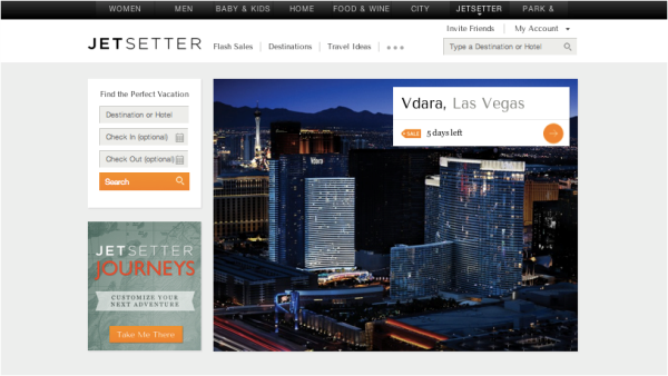
You want your page to be visually enticing. You know what they say - an image is worth a thousand words. Powerful imagery will trigger your visitor to act on your offer. Jetsetter does a good job of this, the pictures are powerful and definitely make travel look very appealing.
3. Stay Simple:
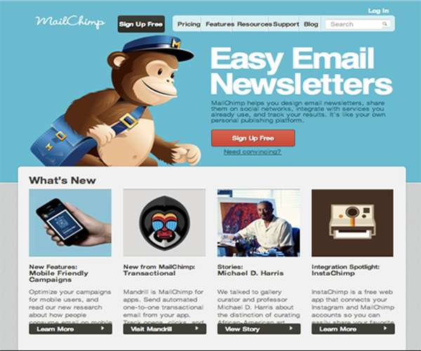
Dont overdo it with the images and stick to your color scheme. You dont want an overly busy landing page that overwhelms your visitors and risks conversion loss. Keep your general color scheme in mind when choosing images so they dont clash. Landing page best practices suggest using a maximum of three colors. Mailchimps landing page does a great job of this, it's simple and sticks to a nice scheme.
4. Keep It Relevant:
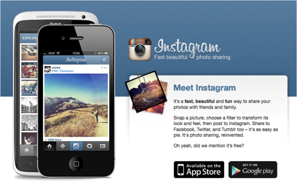
Make sure that the landing page features imagery that clearly shows your product or service achieving its purpose. The goal is always to get the visitor to choose between converting or returning to the home page. Irrelevant images simply distract your visitor from taking action. Take a look at Instagrams landing page which does a great job of this.
5. Know Your Audience:
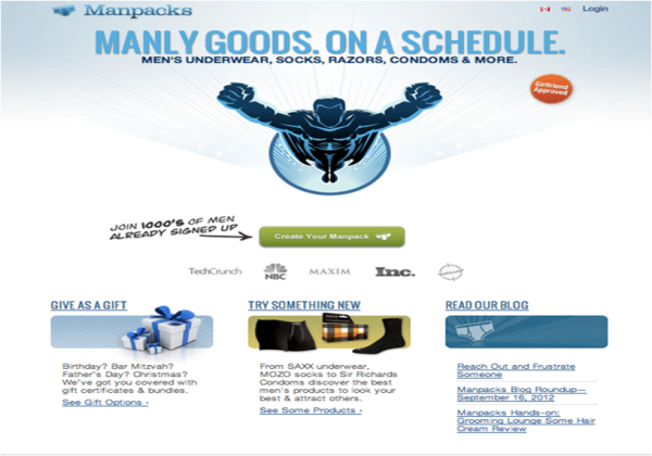
They need to know that you get them, and if you do get them. You should use images that you know will resonate them and evoke relationships between the user and your product or service. Manpacks, does a great job of this with their landing page, they know they are targeting men so they incorporated the superhero image and used masculine colors.
Where to Search For Landing Page Images
Now that youre familiar with landing page best practices for image selection, you should start looking for your photos. You do have the option of looking for images on your own, but there are clear downfalls to that approach. You may risk looking unprofessional. It will take a lot longer to find the photos on your own and youll need to figure out if you have the rights to use those images. The image owners can and will find you if their image is used without paying royalties.
The easiest way to avoid the fussuse a paid photo service. Benefits of using a paid service include:
-
Categories and tags on paid services make it easy to filter images and keep it relevant to your customer/product or service. Makes it much more simple and takes much less time to find the right image.
-
The paid sites above offer a variety of sizes so there is no need to try to resize, crop, optimize on your own.
-
Usage rights are not an issue. Since you paid for it, you dont have to worry about whether or not you can actually use it.
-
Once you find an image(s) you like, smarter Search and browsing functions on these sites make it simple for you to find similar shots to choose from so you have options.
-
Guaranteed to look professional
There are a handful of go-to sites to check out for your landing page image needs. Three of the best are:
1) http://www.istockphoto.com
2) http://us.fotolia.com
3) http://www.shutterstock.com
These three sites have millions of royalty-free photos to browse, giving you vast selections of everything from objects, people, nature, signs, etc that are ready to go for your landing page. Remember, your landing page and its images play a critical role in getting your visitors to act!
What images have been the most successful for you? Post a link below!
About the author
Jacqueline Feldman Read more articles by Jacqueline Feldman.


