Healthcare.gov's Bad User Experience Underscores the Importance of Inbound Marketing
November 21, 2013
By Amber Kemmis

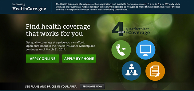
No matter what side of the party line you fall, you can probably agree that the launch of the Healthcare.gov website was far from seamless. The site was launched with little consideration to one of the most important aspects of a website, the user experience. The user experience is especially critical in this case because many of the visitors are not that tech-savvy. Conducting an in-depth analysis of the Healthcare.gov site on the day of the launch would have likely revealed a list of issues far too extensive to completely cover in this blog post. However, Healthcare.gov, themselves, shared some of the basic site issues on their blog including:
- An inability to compare plans without setting up an account
- Problems setting up accounts in the marketplace
- Overloaded servers
- Not enough user testing
- Difficulty completing the application process
As you can see from the list, the user experience was really bad. Now, there hasn’t been an official declaration yet, but I believe one of the cardinal rules of inbound marketing is to make it as easy as possible for visitors to convert to leads or customers. I actually don’t think you need to have any inbound knowledge to know that people want to make their life as easy as possible and something as important as finding healthcare coverage should be as easy as possible. Unfortunately, when Healthcare.gov launched, it didn’t make people’s lives easier. In fact, it only ended up wasting many of the site's visitors’ valuable time.
The consequences of breaking the inbound cardinal rule were profound for Healthcare.gov. According to a poll by Washington Post, 56% of Americans thought the website’s problems were a sign of broader problems. Now, I don’t want to get into politics because we all have enough of that in our lives, but the ratings of Obama and the Affordable Care Act following the launch underscore how important inound marketing and the user experience are when creating a website because it ultimately reflects onto the company or organization’s reputation.
For years inbound marketers have been arguing to create a user experience based on inbound principles, but Healthcare.gov underscores its’ importance more than any other marketing campaign ever has. Fortunately, everyone including Healthcare.gov's developers can learn from this mistake. Some of the most important inbound marketing take-aways here are:
- Never underestimate the power of the user experience.
- Create a great user experience on your website by using inbound marketers (I may be biased, but they know more about UX than web developers).
- Use website analytics and customer feedback to track your site’s use experience.
- Most important, the user experience should be centered on making your user’s life easier! For example, two extra clicks to submit a form when one would do the trick creates a bad user experience.
Next time you launch a website, make the user experience top of mind. The efforts are sure to pay off by protecting your brand's reputation, driving more traffic, and increasing conversion rates.

About the author
Amber Kemmis was formerly the VP of Client Services at SmartBug Media. Having a psychology background in the marketing world has its perks, especially with inbound marketing. My past studies in human behavior and psychology have led me to strongly believe that traditional ad marketing only turns prospects away, and advertising spend never puts the right message in front of the right person at the right time. Thus, resulting in wasted marketing efforts and investment. I'm determined to help each and every one of our clients attract and retain new customers in a delightful and helpful way that leads to sustainable revenue growth. Read more articles by Amber Kemmis.


