By Kira Renee
The e-commerce industry has grown tremendously these past few years and is expected to grow another 10.4 percent worldwide in 2023. With thousands of e-commerce brands competing for attention, it’s not enough to simply have an e-commerce website.
If you’re trying to increase sales and e-commerce conversion rates, a vital step to take is to audit and optimize your website to make the shopping experience simple and enjoyable. The more intuitive a shopping experience is for your customers, the higher the chance is of them converting.
Understand your target audience.
Getting to know your audience and how they shop is key to optimizing your website for higher e-commerce conversion rates. User behavior data will show you where the leaks are on your website so you can fix them directly. There are many tools you can use to analyze your web traffic and get a deeper understanding of how your customers interact with your website.
Here are the top four most effective strategies you can use:
1. Website Traffic Analysis
Use a tool such as Google Analytics or Shopify reporting to analyze the behavior on your website. Is there a high bounce rate on certain pages? Are some pages converting higher than others? Identify your successful pages and apply what you find that’s working on the pages that need some improvement.
2. Heatmap Tool
Using a heatmap tool such as Lucky Orange can help you understand why your store is getting traffic that doesn’t convert into sales. A heatmap scans your website pages to clearly show you where your users click, move, and scroll on your website. This exposes the gaps in your checkout process and helps you identify where users may be getting stuck.

3. User Testing
Another option to really get to know your customers' experiences is by conducting user testing. Usability tests are designed to get feedback from users on your website's design, functionality, and user experience. This can help you identify issues with navigation, checkout process, and other elements of the website that may impact user experience and conversion rates.
4. A/B Testing
A/B testing can help you compare different versions of your website and identify which version performs better in terms of e-commerce conversion rates. This enables you to make data-driven decisions about website design, copy, and other elements.
To gain valuable insights into your audience's interaction with your website, conducting a user experience audit is an excellent approach. At SmartBug, our User Experience Strategists collaborate with you to conduct a comprehensive audit and develop a strategy to address identified gaps. Speak with an E-Commerce Strategist to schedule your personalized audit, or begin the auditing process independently using our Shopify UX Lite Audit Checklist. This checklist covers the most crucial website elements that require optimization.
Optimize website design for higher e-commerce conversion rates.
Once you have combed through the data and determined what roadblocks exist on your website, the next step is to optimize your site by applying best practices and strategies to help mitigate those abandoned sessions. Many features on your website may play a role in your low conversions, but the three most common issues exist with your website navigation, product pages, and checkout process.
1. Website Navigation
An online store should be intuitive for your customers to navigate. If your product or category pages aren’t organized properly or are buried under other pages, your customers may become frustrated when searching for a product, making them more likely to bounce off your website.
Here are some tips to help you improve your e-commerce site navigation:
Simplify your navigation.
Make it easy for users to find what they are looking for by keeping your navigation simple and straightforward. Use clear and concise categories and avoid overwhelming users with too many options.
Expert Tip: If you have too many different product categories, consider condensing them and using tags and filters to help sort through products within a category.
Use descriptive titles.
Be descriptive, and make sure your title accurately reflects the content of the page or category. Avoid using jargon or industry-specific terms that your customers may not understand.
Monitor analytics.
Keep an eye on your website analytics to see how users are interacting with your navigation. You can then use this data to make adjustments or conduct tests to improve your navigation and increase conversions.
2. Product Pages
Your product pages should be the easiest pages to convert on. This is where your customers will decide to buy your product. Make it very clear to them how they can purchase and optimize the page to make it as easy as possible to keep e-commerce conversion rates high.
Make sure your product pages include high-quality, clear images that show products from different angles. This is your opportunity to hard sell your product, so be sure to write compelling product descriptions that highlight the product’s benefits, features, and ways it can solve the customer's problem.
Here are a few more best practices to keep in mind when optimizing your product pages:
Include customer reviews.
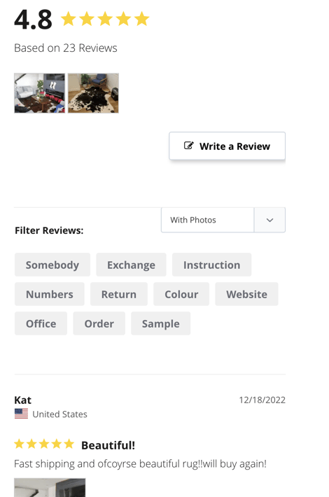
When you put customer reviews on your product page, you provide social proof and build trust. Be creative when generating engagement in your review process. Customers can select star ratings or even leave multimedia reviews that show off the product in action.

Expert Tip: Adding reviews to your page with keywords can also help support SEO efforts, making your products more visible on search engines.
Write a compelling call-to-action phrase to encourage activity.
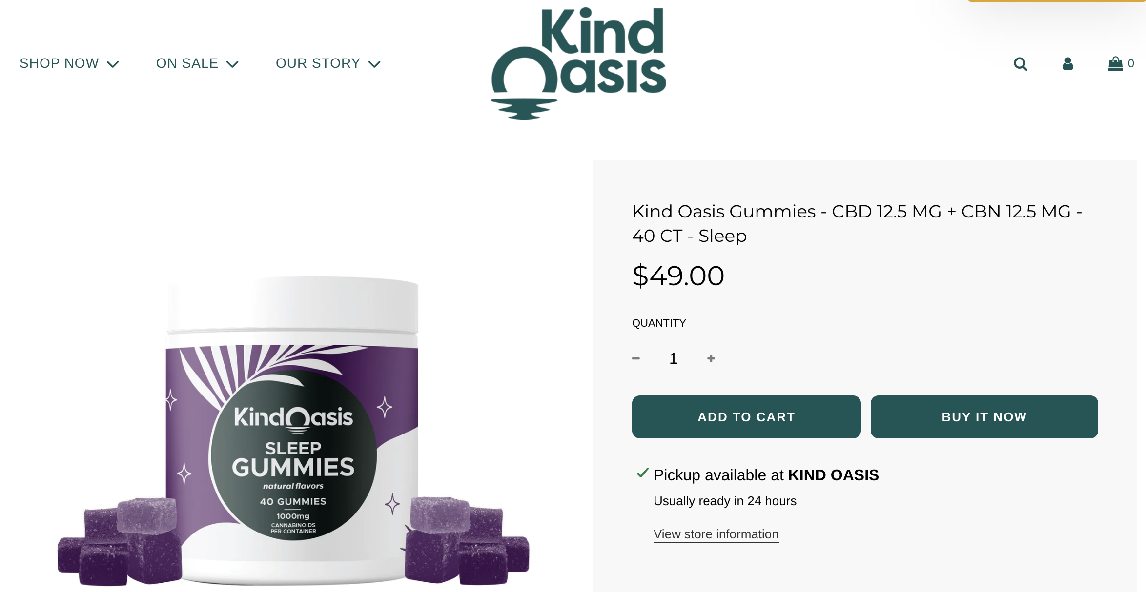
You can take the approach of using two CTAs: "add to cart," where customers can continue browsing, or "buy now," which directs the customer to the checkout page. Don’t forget to use contrasting colors to make the CTA stand out.

Provide clear and concise pricing information.
This should include any discounts, shipping costs, and taxes. Make the pricing information easy to find with prominent placement and a larger font size. If your customer is unclear about how much a product will cost them, it’s highly unlikely they will make a purchase.
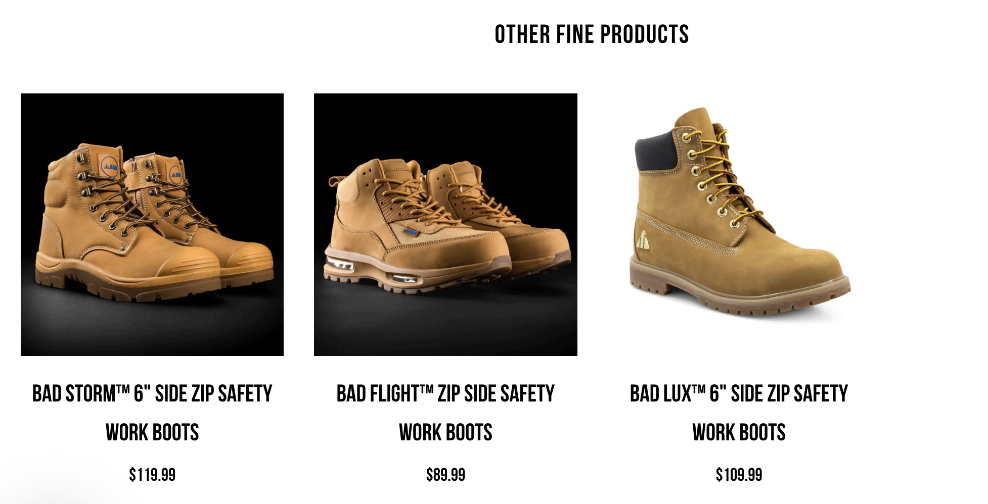
Offer product recommendations.
Recommend products based on the customer's browsing history or purchase history, which is zero- and first-party data you can collect with Klaviyo. This can help lead your customer to the right product and increase the likelihood of them making a purchase.

Use a mobile-friendly design.
Make sure that your product images and descriptions are easy to see on a small screen. According to a Pew Research Center study, 76 percent of adults said they use their mobile phones to shop online, so it’s critical to make sure no obstacles prevent your customers from completing a mobile purchase.
3. Checkout
Your checkout page is the last step in the process, so it’s essential for improving conversions. Your checkout page should have a clean and simple layout with clear labels that are easy to understand. Use an asterisk to indicate required fields.
Here are a few more ways to optimize your checkout page:
Make the checkout process as short as possible.
The shorter the checkout process, the higher the chances of conversion. If your current checkout process is a bit too lengthy, you can fix this by only asking for essential information and using autofill fields where possible. You can also display a progress bar on your checkout page, so customers know exactly where they are in the process.

Offer guest checkout.
Avoid forcing customers to create an account. Many customers will abandon their cart if you force them to create an account to make a purchase.
Offer multiple payment options.
These options can include credit cards, PayPal, Venmo, or Apple Pay. Offering more payment options will increase the likelihood of the customer completing the checkout process.

Expert Tip: Many brands are now offering payment options with tools such as Affirm, where customers can make payments on their purchases over time.

Use trust symbols.
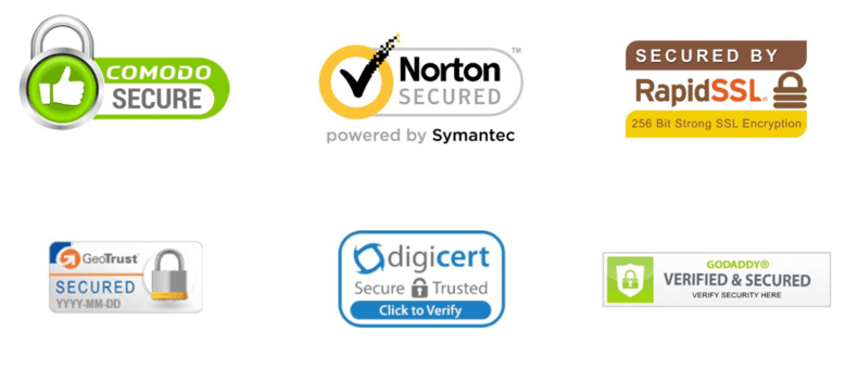
Security badges or trust seals reassure customers that their information is secure. Customers sometimes bounce when brands ask for too much personal information. Only ask for essential information and reinforce trust in your brand through security badges to increase customer confidence and trust in your website.

Reach out to our e-commerce experts.
While website navigation, product pages, and checkout pages are the most essential assets to optimize when looking to increase e-commerce conversion rates, there are many other factors, pages, and features on your website you can audit and optimize for higher conversions. The tactics mentioned above are a great place to start, but continually reassessing your website to find more opportunities to increase conversions is something your brand should do regularly.
If you need more support on increasing your e-commerce conversion rates, feel free to reach out to one of our e-commerce experts who can help guide you through the auditing and optimization process.
About the author
Kira Renee Kira was formerly our Product Marketing Manager at SmartBug. She believes in a people-first and data-driven marketing approach. Previously working with many reputable brands, building their online brand presence and teaching companies how to enhance their marketing strategy to be customer-centric. When she's not creating a stellar marketing strategy, you can find her enjoying a crisp sour beer surrounded by her hundreds of plants and receiving cuddles from her Labradoodle. Read more articles by Kira Renee.


.png?width=200&height=260&name=Shopify%20UX%20Audit%20Checklist%20(3).png)


