How to Turn a Boring 404 Page into Something Brilliant
July 23, 2018
Have you ever been lost? It’s not a good feeling. Your head spins while you frantically try to locate something familiar. You probably remember getting lost in the grocery store as a kid, or getting lost on a backroad before the Maps app existed. Nobody likes the feeling of being lost—and that includes your website visitors. Here’s how you can craft a brilliant 404 page on your website to help your lost visitors find their way back home.
What Is a 404 Page?
Before turning a 404 page into something brilliant and creative, let’s clarify what a 404 page actually is from a technical standpoint.
The number “404” is an HTTP status code. That sounds fancy, but it’s essentially internet language for what translates to “page not found” in English. When this error code occurs, it means your website visitor has landed “off the map” and onto a page that doesn’t exist.
How does this even happen? To understand how and why 404 errors occur, you need to understand the three basic components of a URL:
- The protocol: “https://”
- The domain name: “smartbugmedia.com”
- The path: “/blog”
If a visitor accidentally types “https://www.smartbugmedia.com/blahg”, he or she will land on a 404 page. Why? Because although the protocol and domain name of the URL are correct, the path is invalid and leads to a dead end.
How to Make a Brilliant 404 Page
The 404 error is typically caused by the visitor, so it‘s unlikely to be your fault as the developer. However, the last thing you want is for visitors to get frustrated and leave your website. With a little wit and intelligence, you can take a potentially negative experience and turn it into a positive one.
In recent years, right-brained creatives have found ways to take 404 pages to the next level. That means 404 pages still serve the practical purpose mentioned above, but they are also becoming 24/7 brand ambassadors.
To illustrate, let’s look at how four companies took a boring 404 page and turned it into something brilliant:
1. Spotify
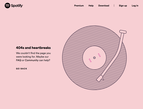
The 404 page on Spotify’s website is witty (with its clever reference to Kanye West’s album 808s & Heartbreak) and well designed with custom graphics. Instead of simply saying “page not found,” the developers included a link to the site’s FAQ page and took the opportunity to promote their Community page as well. When designing your 404 page, think about what resources you can redirect the visitor to on your website.

2. Pixar
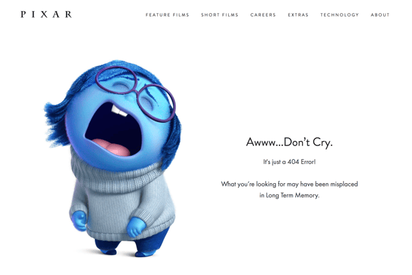
Thanks to the creative giant Pixar, grown-ups get the chance to feel like kids again. Known for its computer-animated movies, it’s no surprise Pixar has designed a fantastic 404 page. The whimsical use of the “Sadness” character from the movie Inside Out not only builds Pixar’s brand image, but also turns a negative situation into a positive one by making you crack a smile.

3. Nike
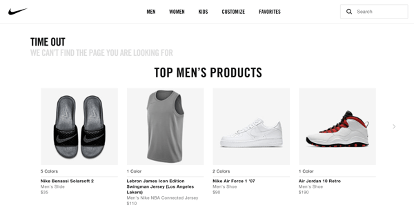
Nike has also stepped up its game with its version of the 404 page. Look closely and you’ll see a very subtle “We can’t find the page you’re looking for” message, and then the user is immediately presented with Nike’s best-selling products. Do you have an e-commerce website? If so, take note of this strategy.

4. SmartBug
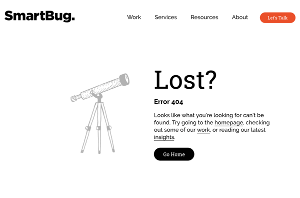
To prove that we practice what we preach, here’s our very own 404 page (shameless plug). In the design of this page, we provide links to some of our most popular resources, offer a call-to-action that takes the user back to the homepage, and include a simple telescope icon to support the page visually. We’re confident that users who land on this page will find their way. Mission accomplished.

Final Thoughts
You now understand the practicality of a 404 page, and more importantly, the potential it holds to create a positive user experience. Armed with knowledge and inspiration, it’s time for you to create your own. If you’re a HubSpot customer, you can go here to start building your brilliant 404 page.
Plan, design, build, and launch your website successfully with:
Mastering The Art of Website Redesigns
Check It Out
About the author
Benji Bateman was formerly a Marketing Consultant based out of Knoxville, TN. With three years of HubSpot experience, he’s helped 15+ clients grow their digital presence, improve their visitor-to-lead conversion rates, and drive more sales for their organizations. When he's away from his desk, he’s likely watching a Clemson football game, listening to live music, or traveling like a local. Read more articles by Benji Bateman.


