How Website Personalization Increases Lead Conversion Rate
March 2, 2017
By Juli Durante
One key metric for many websites is visitor-to-lead rate: How many of your site visitors ultimately convert into new leads. Although many factors control what your lead conversion rate may be, a key consideration is your website’s user experience. If it is difficult for visitors to actually use your site, it’s considerably harder for them to convert. In the same light, if you aren’t serving visitors the right information for their needs, they also won’t convert. This is where website personalization comes in.
What Is Website Personalization?
When you personalize your website, you introduce content tailored to what you know about specific visitors: their buyer persona, how often they’ve visited your site, lifecycle stage, location, and even mobile-versus-desktop usage are excellent personalization signals. Depending on the CMS and marketing tools you’re using, there are different personalization options you can choose. If you’re working on a HubSpot website with HubSpot tools, here are just some of the places you can use personalization:
- Calls to action
- Website page copy
- Landing page copy
- Forms
Essentially, for HubSpot websites, you can use personalization for almost all web content. Now, if you’re using HubSpot and don’t have a website on the HubSpot CMS, your options for personalization are considerably limited: calls to action are your best (and only) bet for personalization.
Why Does Personalization Affect Lead Conversion Rates?
When HubSpot first unveiled personalized content and the (no longer new) Content Optimization System, I remember thinking, “Oh, that’s pretty cool—but a neat party trick isn’t enough to get me off of WordPress!” Upon first look, that’s what personalization feels like. However, it’s not just sleek or cool: As I (and many other marketers) quickly realized, personalization has measurable ties to site performance.
Why? Personalization is simply the logical next step in inbound marketing, the core of which is delivering the right message to the right person at the right time. What does that look like when you have personalization options? Consider this common marketing predicament:
On your website’s homepage, you have a content module for highlighting one premium content offer. It actually performs quite well: When you heatmapped the page, you found that 65 percent of visitors are seeing that module, and the CTA for the awareness offer you used at site launch has a 7 percent view-to-click rate! You’ve recently created a new piece of content, a comparison guide at the consideration stage of the Buyer’s Journey, and swapped it for the original awareness CTA. Unfortunately, a few weeks after launch, you saw the view-to-click rate drop to 1.3 percent.
What happened?
Likely, you’re serving the wrong content to the wrong people at the wrong time. That’s where personalization helps. Instead of continuing to serve your consideration stage content to every site visitor, here’s a basic personalization framework to build upon:
- Unknown visitors (who are not yet contacts in your database) are served your highest-converting awareness offer.
- Anyone who has downloaded awareness content
- Anyone who has downloaded your consideration stage offers sees a decision-stage offer, such as a demo or consultation request.
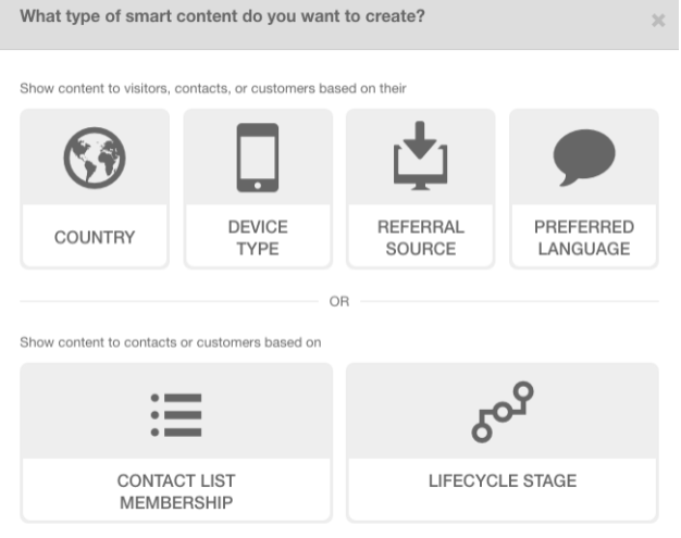
The above example is a very simple approach to personalization. It works because it serves up “the next step” to known visitors and capitalizes on a top-performing offer for strangers. However, it does not take into account buyer personas, individual content offers downloaded, geographic location, device type, most lifecycle stages, any many other factors, all of which can be put into personalization rules. Here’s a look of some smart content options within HubSpot: 
As you can see, HubSpot gives you quite granular options for personalizing content on a site page. There are effectively two ways to look at personalization in HubSpot: personalization for unknown visitors and personalization for known contacts.
Personalization for Unknown Visitors
Personalizing content for unknown contacts is the action that’s going to affect your website’s visitor-to-lead rate the most, because converting strangers to leads/new contacts is what your VTL rate measures. Within HubSpot, you can serve personalized content based on country, device type, referral source, or preferred language. How can you use that to your advantage?
1. Country-Based Personalization
If your business is global, you may find that some geographical personalization makes sense for your site. Here are two use cases:
Site content
Let’s say you serve prospects both in the U.S. and the U.K. In developing content, you are likely using either a U.S. or U.K. spelling of certain words. This is 100 percent a best practice: You want to have consistency in language, and I wouldn’t recommend using smart content to make major changes to content in this way—especially because any PDFs or non-web content you use won’t accommodate the difference in spellings. However, you might find that in promoting one piece of content on a landing page, you want to pull out different key points for the two locations. Perhaps a trend is more established in the U.K., and you feature the more in-depth analysis your content provides for that audience, while focusing on the explanatory content for the U.S. audience.
Why does this work? Because your guide covers both of the previously mentioned topics, you’re using personalization to highlight what that specific visitor needs to know.
Forms
Forms are another key area where geographical personalization can be important. One best practice with forms is to keep them as short as possible while still collecting necessary information. However, some countries require really specific opt-in policies for email: It may not be enough for a contact to fill out a form; they may need to say “Yes, I want you to email me!” At the same time, adding another field can decrease submission rates. This is where personalization and smart content come in. If you have significant visitorship from those countries (check Google Analytics!), consider setting up smart content so that the default is your contact form without the extra opt-in field. For countries where explicit opt-in is required (for example, Canada), show a different version of that form with the check box added.
Why does this work? You’re showing the shortest form possible to the highest number of visitors, which improves the likelihood of conversions. Plus, you’re remaining legally compliant where necessary.
2. Device Type Personalization
Device type personalization takes into account whether the visitor is coming from a desktop browser, tablet, or mobile device. Especially on landing pages, it can be an excellent way to reduce friction and improve conversions. Here’s my favorite use case:
Shorter forms for mobile
Just as in the previous example, you displayed a slightly longer form for Canadian visitors, You can show a shorter form to mobile visitors. Because form submissions are especially difficult on mobile devices, reducing friction here can yield huge benefits for your conversion rates, especially if you’re attracting many mobile visitors from social media or paid search. You can use Google Analytics to capture this mobile information and determine whether it’s a necessary step.
Why does this work? Shorter forms are easier to fill out. Reduce friction and see tremendous results.
3. Referral Source Personalization
If your landing pages get a lot of visits from referrals, maybe because you have some mentions on others’ blogs or you’re doing some paid content promotions, you can choose to use a bit of personalization instead of creating new landing pages. For this, might I suggest:
Personalized headings
Let’s say you see that one of your landing pages, for a consultation request, receives many visits from one referral source but very conversions. It’s likely a great use case for personalization because you often can’t get another website to change the page of your site they’re linking to. In this case, use personalization to make your page heading or bold copy align with the copy and anchor text on the referrer’s site.
Why does it work? We know that landing page copy that is more closely associated with call-to-action copy tends to convert at a higher rate. Use that logic to make your personalized landing page a little bit more like the page that sent visitors to you (in other words, the page that “called them to action”).
4. Preferred Language Personalization
First and foremost, this type of smart content can be tricky to pull off and is not the best method for creating a multilingual site, as you’ll need to use a smart module for every kind of onsite content. However, if you’re seeing (again, via Google Analytics) that you have some multilingual traffic coming into specific site pages, that may be an indicator to add some personalization based on that language.
Why does it work? This one is fairly straightforward: Visitors who have a language preference will more readily convert in that language.
A note on personalization for unknown visitors
If you’re incorporating this “unknown visitor” personalization, keep in mind that it will also apply to known contacts in your database. So customers who meet the device type or referral source criteria will still see the personalized content. Generally, there is no problem with this, but it is definitely a good thing to keep in mind as you set up personalization rules.
Personalization for Known Contacts or Customers
Although personalization for known contacts and customers, based either on list membership or lifecycle stage, won’t directly affect your lead conversion rate, it can be instrumental in moving leads through the Buyer’s Journey. Remember, your goal is to show the right person the right message at the right time. That means a known visitor may need a different CTA than someone who has never filled out a form: A customer, for example, might benefit more from a specific “Ask Support” CTA than a generic “Contact Us” or “Talk to Sales.”
With that in mind, personalization for known contacts can be incredibly detailed and granular. You can build a list in HubSpot based on as many criteria as you want—so much so that you’re showing few people your personalized content. As you build out personalization for known contacts, keep this in mind. Don’t forget to ask yourself:
But How Many Rules Should Personalization Have?
My approach is simple: As complicated as it needs to be, but no more than that. Yes, you can add personalization rules in HubSpot for just about everything. The ability to incorporate your HubSpot lists into personalization rules means you can create an almost never-ending web of statements to serve content.
At the end of the day, the main question to ask is: Am I adding this personalization because it will help my website visitor or because I think it’s cool? Does a significant portion of my database meet this criteria, or am I building out extensive conversion paths for five potential visitors?

About the author
Juli Durante was formerly a team lead and marketing strategist for SmartBug Media. She has been using HubSpot and practicing inbound marketing since 2011, first as a one-woman inbound marketing team and then at SmartBug. A born and bred Jersey girl, she's a graduate of Rutgers University where she studied Anthropology, Art History, and Classics, making a very natural transition to digital marketing. Juli's education helped her learn more about research, analysis, and Jasper Johns, which she applies today when planning and measuring campaigns. She's particularly passionate about CRO and website optimization. Read more articles by Juli Durante.


