Responsive Banners for Website Design: Difficulties and Best Practices
August 9, 2023
Whether you are a marketer, developer, or designer, at some point you’ve most likely run into responsive issues with banner images. At SmartBug, our developers work primarily in the HubSpot platform, and this is by far the dev issue we have to explain to clients most frequently.
A common question asked by clients wanting to update their website is, “What is the proper aspect ratio for banner images on my website?” This is a complicated question, and the answer depends on many attributes of the banner, such as whether the banner has text overlayed on it, whether there are lifestyle images in the background, and the size of the text on the page. Let’s explore some of these nuances.
Banner Images with Text Overlay
For many webpages—especially landing pages—having a text overlay on the banner is the most appropriate choice for a handful of reasons.
First, using actual text that Google can search and index is a great way to get an H1 above the fold. Text that is part of the banner image won’t have any SEO value and may run into responsive design issues with the text being cut off at various widths.
Banner images commonly use a CSS declaration called “cover” that constantly adjusts the background image to fit the banner container as well as possible. However, this leaves room for variation and inconsistencies in how the image renders at different heights.
When choosing images for banners with text overlays, there are three important components to consider:
- A simple pattern is often the best course you can take when it comes to background banner images. Images that are relatively generic can have their edges cut off on smaller screens without negatively affecting the design aesthetic.
- The developer should put a banner overlay between the text and the background image. This is often a translucent black or colored layer that allows the text to be readable regardless of what color image is in the background.
- Do not use lifestyle images (images of people) as a general rule of thumb. It’s awkward to have text covering somebody’s face. In reference to rule one, it will be even more awkward when that person’s face gets cut off on a smaller screen.
Below is an example of a lifestyle image with text overlay getting cut off at specific widths because faces are too close to the edge.
Banner Images with Text in the Background
For certain page designs where the entire banner is crafted into a brochure-style image, having a banner image without text is acceptable. If you absolutely must have a banner image with text in the background, it’s imperative that you have the developer create the banner in a way that calculates the height and width of the banner based on the aspect ratio of the banner image. This can be done in JavaScript or jQuery (a JavaScript library) and must be set up in a way that can recalculate the height based on the changing window size so that if a user is on a tablet and they change the orientation from landscape to portrait, the aspect ratio remains correct.
An easier alternative that doesn’t require JavaScript is using a static full-width image. By default, most websites have a maximum image width of 100 percent of the container they are placed in that is set by CSS. This ensures the banner will always be the correct aspect ratio—no matter the width—as long as the image is large enough to be full-width on external monitors without becoming pixelated.
One thing to keep in mind when it comes to text on a banner image is that as the image proportionally shrinks down to fit a small screen such as a phone, the text will also shrink and may become illegible due to its small size. When using text in a banner image, it’s best practice to only use large headlines that won’t shrink to an unreadable size—and it’s even better to use overlaid text so a developer can set custom sizes for various devices and browser widths.
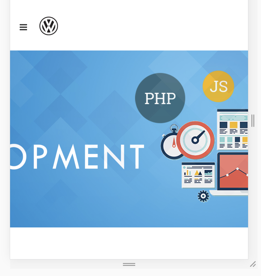
Below is an example of a banner that uses text in the background that doesn’t scale aspect ratio well:

Whether you are a marketer, developer, or designer, understanding the dynamics of how background banner images work will ensure that, when you’re making changes to a site or picking out images for banners, you can pick them in a way that will ensure they render correctly on all devices. Although the above list of options is not exhaustive, it provides a good road map for the vast majority of use cases to make sure you don’t need a developer to update your website with each image change.
Any combination of images and text can be possible for your website if you have an active developer who can make a completely custom solution. Any marketer will tell you that they love harnessing the ability to easily create future-proofed websites and landing pages without ever needing somebody to dig into code.
By focusing on responsive banners, you can provide a seamless user experience and make a lasting impression on your website visitors. If you need further assistance, our team at SmartBug Media is here to help. Happy designing!
Want to know what building a website with us looks like? Watch the video below.
This blog was originally published in 2019 and has been updated since.

About the author
Karlina Hernandez was formerly a passionate and creative Sr. Account Specialist at SmartBug Media. She’s an experienced professional with 6+ years of Marketing experience, focused on Digital, Social Media, E-commerce, and Project Management. When she's not in front of her computer, she's traveling or discovering new restaurants that offer innovative dishes and experiences. Read more articles by Karlina Hernandez.


