Seven Call-To-Action Examples From the Pros
April 5, 2016

We’ve all seen them. Some of us have even left websites because of them. Calls-to-action, or CTAs, that were executed with poor strategy…or worse, no strategy at all. Thankfully, professionals exist, creating well-designed, irresistible CTAs that drive conversions on their websites.
According to HubSpot, the essential elements that make up a quality CTA are eye-catching design, copy that makes people want to act, a clear value proposition, and a link to a specific landing page (that aligns with the appropriate stage in your sales cycle). In addition to the above components, marketing guru Neil Patel suggests that effective CTAs live above the fold (the portion of the webpage that you can see without scrolling) and offer immediate results. He also points out the importance of social proof, or influencing people to act based on what others are doing. Keeping those characteristics in mind, let’s look at seven call-to-action examples from some of those who do it best.
Pinterest teases you until you sign up, giving you limited access to their addictive content. No need to worry about staying above the fold, this CTA follows you as you scroll down the site. All of the key elements are here - it is visually appealing and easy to complete, demonstrates social proof in the large number of members and pins, explains the benefit you will receive and allows you immediate access to the site. This CTA also incorporates a social sign up option. Social sign up is becoming very popular and works well with Pinterest, as people can easily share ideas and projects with friends and family.
Dropbox
This CTA is a prime example of a visually appealing layout offering a clear value proposition. Visitors can almost immediately understand what the product does, how it will benefit them, and be on their way to a free trial. For those who are ready to commit, the “purchase now” option is conveniently placed, but for those who need to know more, the top menu offers one click access to resources, product features, pricing, and sales support. Dropbox presents a wealth of information above the fold, but in a cleverly minimalist package.
Evernote
Remember everything. A bold statement, but one that concisely summarizes the perceived value that users expect from Evernote. For a product that promises to simplify your life, it’s only appropriate that the clean page layout and call to action make it easy as well. Above the fold, visitors get a visual of tasks that can be managed, how they are simplified, and a simple sign up form. Just below the fold, Evernote displays up-front pricing and plan features that make it easy for visitors to find what they are looking for and engage immediately.
Birchbox
Birchbox is doing a lot of things right when it comes to the essential CTA elements: there is visual appeal in the photograph of their current beauty box, the copy boasting the benefits of the selected products encourages visitors to act, and there is immediate satisfaction in knowing that once signed up, a box of goodies is in the mail and on its way to your doorstep.
The main focus is on the monthly subscription box that they assemble, but below the fold, Birchbox also gives visitors the option (via CTA) to select a curated box of cosmetics that is tailored per client, offering an additional conversion opportunity for customers who found new favorites in their monthly boxes and want to ensure they keep receiving those specific products.
Hautelook
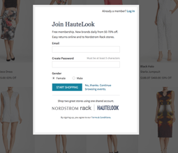
 Unlike other membership-based retail sites, Hautelook allows browsing, but in order to purchase the item that you’ve just fallen in love with, membership is required. This CTA is effective because it not only gives an idea of the value that members receive (50-70% off), but also puts their convenient return policy right up front. Hautelook is a member of the Nordstrom family, and anything purchased on the site can be returned to the nearest store. Considering many online shoppers have concerns when it comes to returning items, including this policy right at sign up is a great way to make potential members more comfortable with shopping on the site. Completing the form also gives visitors access to both Nordstrom Rack and Hautelook with just one sign up - extra incentive to join.
Starbucks
There are a lot of components on this site, but they all play nicely together, offering landing pages for eachstage in Starbucks’ sales cycle. Sales and promotions along the top to increase awareness, a featured item and drink descriptions for those in the consideration stage, and for those who are already addicted, easy access to Starbucks rewards account information. And there’s no question of visual appeal here with product images that make visitors want to run out and grab a frappuccino.
Verizon
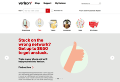
 This simple CTA gives a clear reason why people should click—financial incentive. Verizon puts their value proposition front and center, making it easy to understand what they are willing to offer those who make the switch to their service. There is also the promise of immediate answers that can easily be found on the site. In comparison to competitors’ sites, Verizon’s is also less cluttered, instead focusing on simple CTAs and icons that help visitors quickly find the information they are looking for.
These seven CTAs are great examples of how combining elements of design and persuasive content can quickly lead to conversions. What other compelling CTAs have you seen recently?
About the author
Kristin Lisak was formerly a Senior Consultant at SmartBug Media. She has experience as an in-house B2B marketer, focusing on inbound marketing strategy and implementation. Kristin has a BBA in Marketing from the University of Wisconsin-Milwaukee. Read more articles by Kristin Lisak.


