The Design of a Landing Page for Your Paid Media Efforts
October 9, 2018
If your business has ventured into the land of pay-per-click (PPC) advertising, you will soon come to the conclusion that you will need a landing page that converts well to make your efforts worth their merit. “What are the essential elements that create a good PPC landing page?” you may find yourself asking. I’m here to answer that question and help you make sure that when users land on your website, you can keep your conversions high by following best practices and tested methods.
Keep It Simple
When users arrive on your landing page, it’s important that they aren’t inundated with more information than necessary. If your offer is a way for the user to find out more information about a product or service by signing up for a demo or consultation, you’ll want to provide enough information to intrigue the user, but not overwhelm them with text. In as succinct a way as possible, you should prove that you are an expert by showing them your value proposition. In this same regard, consider how many form fields you require the user to fill out. People are very hesitant to give out personal information, such as a phone number, if they are not sure of the validity of your company or service.
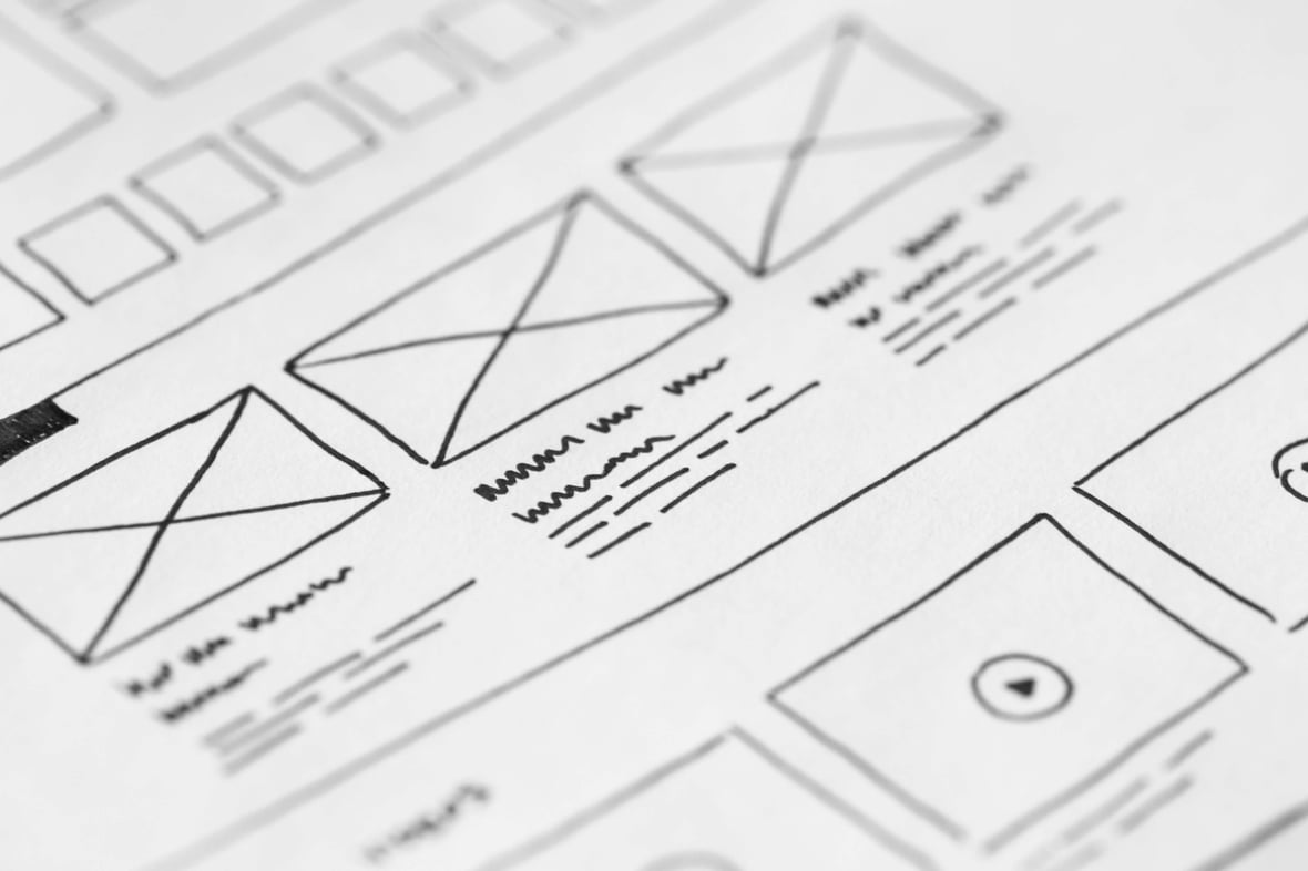
In regards to the design of your landing page, keeping it simple still rings true. For many cases, a single column template will be your best choice for controlling the flow of how your visitors digest the information. However, you may find that if your PPC landing page requires a bit of information, a two-column layout is beneficial because you can keep the form above the fold, which prevents the user from having to scroll down in order to complete the form and become a lead.
Don’t Skimp on Aesthetic
When users arrive to your website, you get one chance to illustrate your value, and a page with poor design aesthetic is a substandard first impression. Working with a designer to choose font type, color palette, imagery, and any other important design elements will give your potential customers a window into your credibility.
Keeping it simple not only from a content perspective but also from a design perspective is also important. Too many images or elements may distract the user from the intended purpose of becoming a lead or customer. Working with a designer to use white space effectively will force the user to draw their attention to your copy and form without getting distracted by unnecessary items.
Design Content to Be Relatable to Keywords
When you start to create your landing pages, make sure not to reuse imagery or copy that isn’t directly related to the search terms or keywords that brought the user to your website. People tend to reuse landing pages that have worked in the past without changing key design elements such as the banner image. Using generic imagery may work fine for elements such as banner backgrounds, but as with any good marketing campaign, testing different imagery and layouts is crucial for conversion rate optimization. I have often seen people using stock corporate photography on landing pages that isn’t quite related to the search terms that brought me to the page.
Consider that the imagery you use can convey potential benefits to your user. Lifestyle images of people using your product or service can reinforce your value proposition in a way that words may not be able to. Seeing a product or service in action can also portray the utility of what you’re selling in a meaningful way without just being an abstract idea. No matter how you decide to frame your information on your page, remember that testing variations over a large sample size will be the only way to know if you are effectively delivering the necessary content to potential customers.

About the author
Evan Futterman was formerly the Director of Development at SmartBug. With a Business degree in Computer Information Systems, Evan has both the technical and business knowledge to deliver the quality SmartBug Media clients expect. When not doing web development he can usually be found outside exploring the outdoors. Read more articles by Evan Futterman.


