What Is a Mood Board, and How Can It Influence My Website Design?
December 27, 2019
A website design has been ordered, and you work feverishly to create a look that matches the expectations, preferences, and requirements set by the client or key stakeholders at your organization (depending on whom you are creating the website for).
After all your efforts, you unveil the website, only to get this response: “This looks OK, but it’s not exactly what I had in mind. Can you easily change this and this and this?”
Your first thought at hearing this probably will be “Ugh!” (or something we can’t print in a family-friendly blog). More than likely, the changes requested aren’t so easy, and much of the hard work you put in—again, based on the direction you were given—must now be amended, often with additional time you simply don’t have.
Usually, the request for changes after you have redesigned a website isn’t because your clients or co-workers are jerks. Simply, during the planning process, something was misunderstood or envisioned a different way, or the design just doesn’t deliver the impact to the client that it does to you. Website specifics such as images, fonts, and UI naturally can vary, but you want those specifics cemented before you put time and effort into the final design. Free website themes and templates can also help with this process.
Mood boards can be the answer to this problem. This design strategy offers concrete direction for your website, actually provides more flexibility with your design, and prevents you from getting too, well, moody (you know we had to go there).
Here are details on how mood boards work and how they can influence your website design:
The Mood Board, Explained
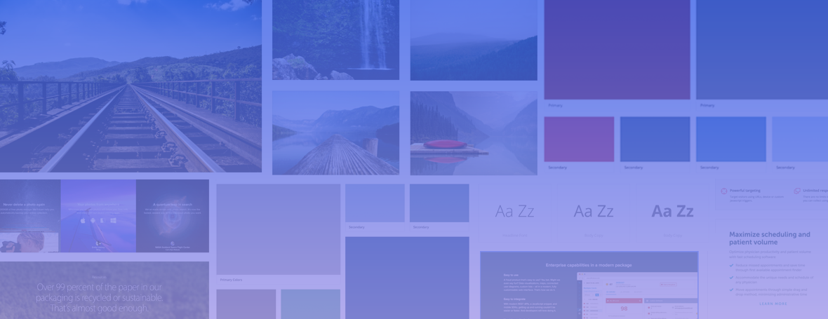
A mood board is a digital collage or group of elements that helps define the direction of a website. It shouldn’t be confused with a mock-up, which is a more concrete version of a website that is only a few steps away from going live. The mood board can be considered an advanced sort of creative brief, but instead of written descriptions of the visual and UI elements of a website, you include the actual visual and UI elements.
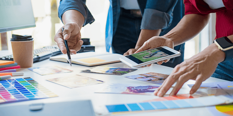
Perhaps a good way to describe a mood board is to compare it to the tools that non-digital designers use, such as paint and fabric swatches for interior designers. Among the samples you can incorporate into a mood board:
- Images
- Fonts
- Colors
- Graphics
- Patterns
- Grids
- Screenshots of other websites (as examples of UI)
- Basic text (not fonts, but rather the words you might use for headlines, dropdown menus, and links)
- Layout
Setting the Mood
Mood boards are usually casual—nothing set in stone. Their purpose is to gather ideas and inspiration before jumping into formal design. For example, what will your overall tone and voice be: light or dark? Professional or playful? These ideas could come out of kickoff calls, meetings, creative briefs, and persona calls. Other websites can be a source of ideas as well—nothing directly copied, of course, but just used as examples and inspiration to start a conversation with the client.
Benefits of Mood Boards
Perhaps the greatest benefit of a mood board is that it helps avoid any misunderstandings that may stem from trying to describe something verbally. Avoiding big surprises should be a goal for both you and your client, and the process of creating a mood board makes clear to clients that you are listening to them and interpreting their ideas visually.
Other advantages of using mood boards include the following:
- Notes can be added to the mood board in whatever application is being used (at SmartBug, we create ours with InVision). Suggestions and comments can be easily made and considered before any website design occurs.
- The design process can be streamlined, reducing the time spent later on revision requests because misunderstandings and surprises are minimized.
- Mood boards aren’t just for clients: Designers can use them to communicate concepts to the rest of the creative team.
- If a client doesn’t have a full style guide and maybe uses only two colors in its brand, a mood board is a good way to pitch colors that contrast well with the original palette.
Keys to Creating a Mood Board
Mood boards are more effective than multiple mock-up variations. Developing comps is time-consuming and can become expensive for the client. By presenting mood boards, the designer has more control, over the ideas suggested and the direction of the design process.
When researching what to include on a mood board, I look at a ton of web design galleries, as well as take screenshots—and inspiration—from websites that I find unique but also would work for the project audience. During kickoff calls, our team will get insight into what clients like with their three favorite website projects. What they don’t like is just as important: It narrows down what I should be focusing on.
As already stated, we use InVision to create our mood boards. The application offers a mood board project option that makes it easy to add color swatches, text, and images in a grid or mosaic structure. InVision also provides links to share with clients, who can literally click on each element of the mood board and write comments.
This feature is fantastic, because it enables clients to offer as much feedback as possible on what they like and don’t like, thus reducing the odds that something is lost in translation. By pinning down the colors, fonts, images, and overall tone, adding the design to the wireframes becomes much easier—the process is smoother.
Finally, always focus on design with your mood board, not content. You likely have seen plenty of great websites with poor content, as well as great content stuck in unattractive designs. Although content should complement your website’s design and vice versa, getting hung up on that before you even have a new site can stall your project and turn the mood board into more work than anticipated (and is counter to the strategy of using mood boards in the first place). Keep your mood boards as design-focused as possible. Beyond a few words you might suggest for display text (and to contribute to the design), save the content for later.
Want to know what building a website with us looks like? Watch the video below.
This post was originally published in March 2017 and has been updated.

About the author
Amanda Singleton was formerly a Senior Designer at SmartBug Media. With over 8+ years experience in the field, she has an innate sense for clean design and is a strong advocate for the user. Read more articles by Amanda Singleton.


