Changed
Changing the Way Customers Pay Down Debt
Background
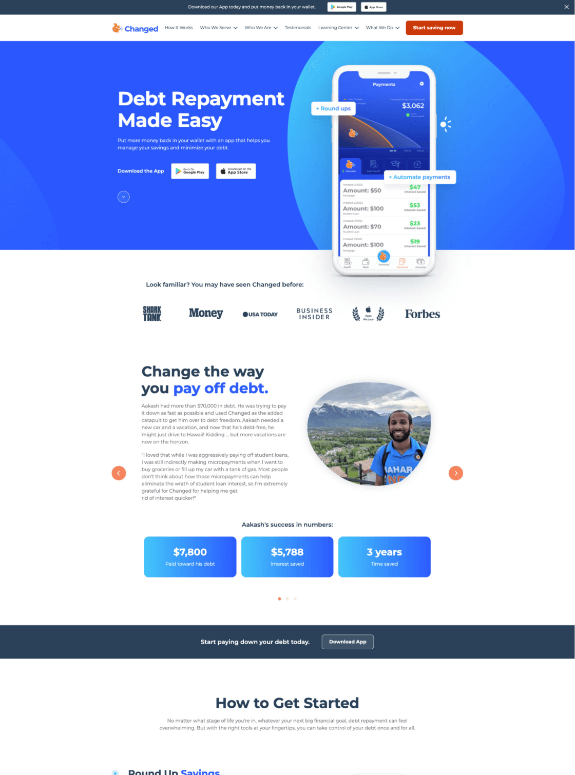
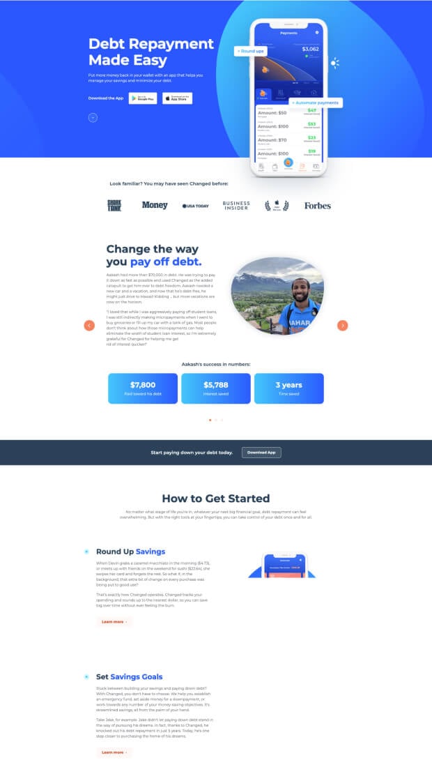
When former Shark Tank contestants Nick and Dan approached SmartBug, they were looking for a fresh web redesign to showcase their debt repayment mobile app. As Dan and Nick explained at kickoff, the Changed mobile app allows users to begin their debt repayment journey pain-free by rounding up spare change at the point of purchase and automating their savings goals.
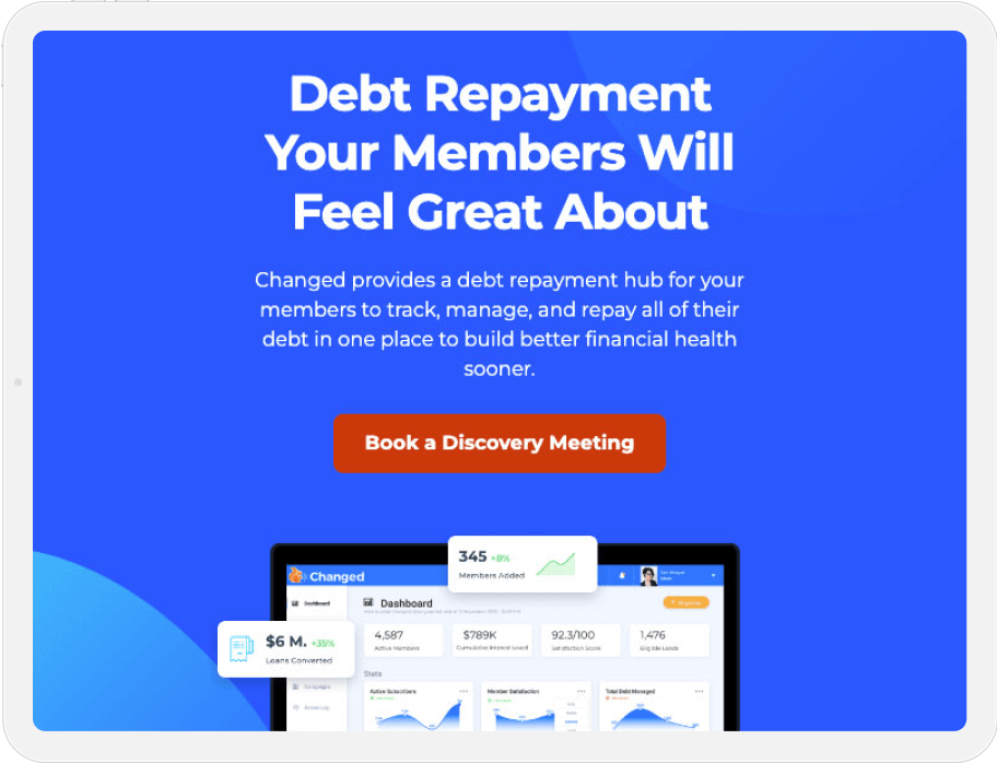
The SmartBug team had their work cut out for them. The primary objective? To build a new site with intuitive navigation for both B2B and B2C audiences while creating cohesion across the site and mobile app. The team at Changed also wanted visitors to be able to calculate exactly how much they could save by using the Changed mobile app.
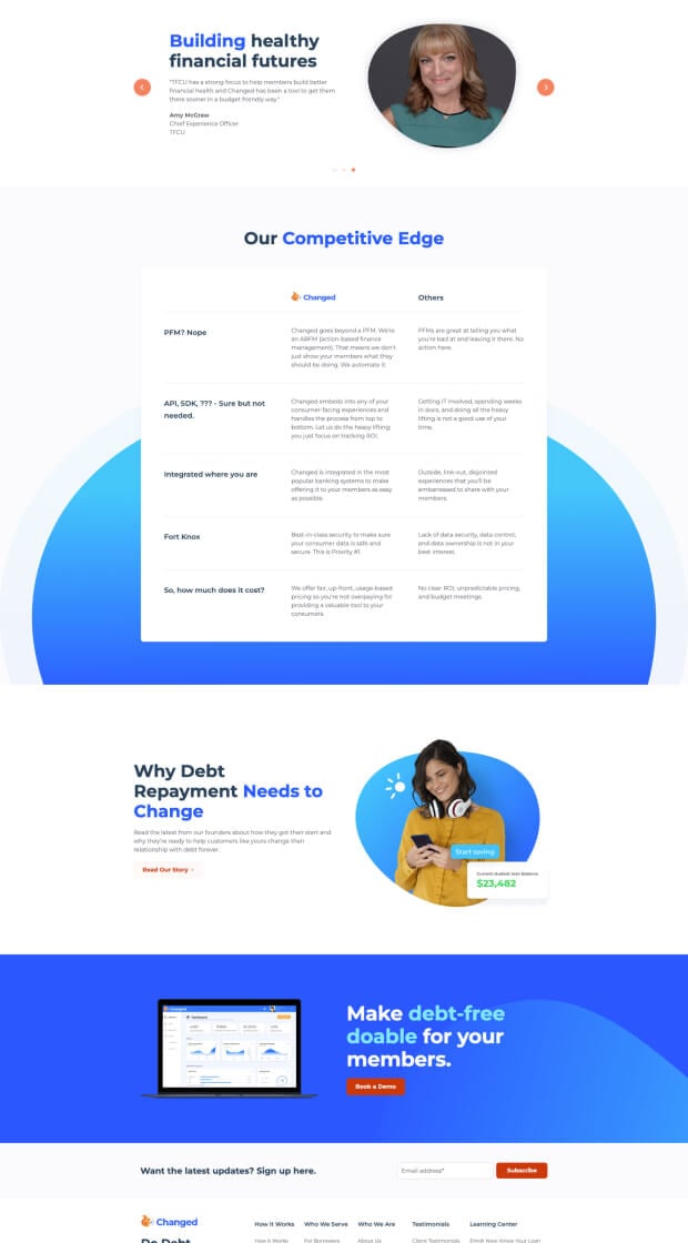
Now, post-launch, Changed entices visitors with a modern web aesthetic, a cohesive UX strategy designed for B2B and B2C buyers, and a custom calculator that lets users explore just how much they could save and how quickly they could pay off their debt using the Changed mobile app.
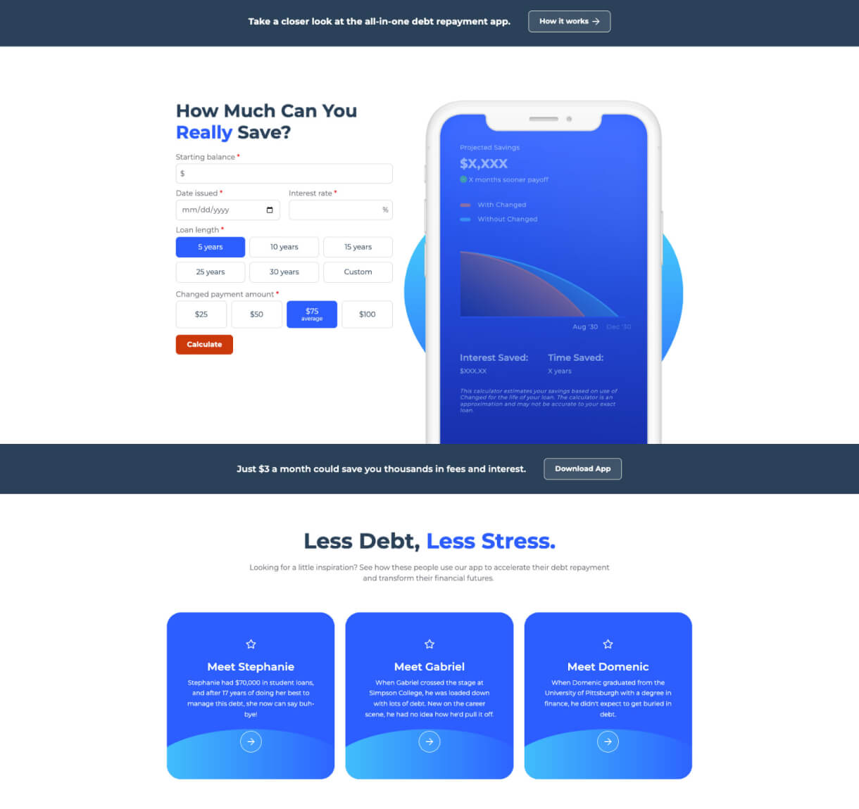
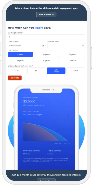
Custom Calculator
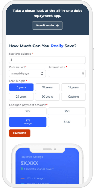
Users enter their loan balance, the length of the loan, the date issued, and the interest rate to determine their total potential time and cost savings with the Changed mobile app.
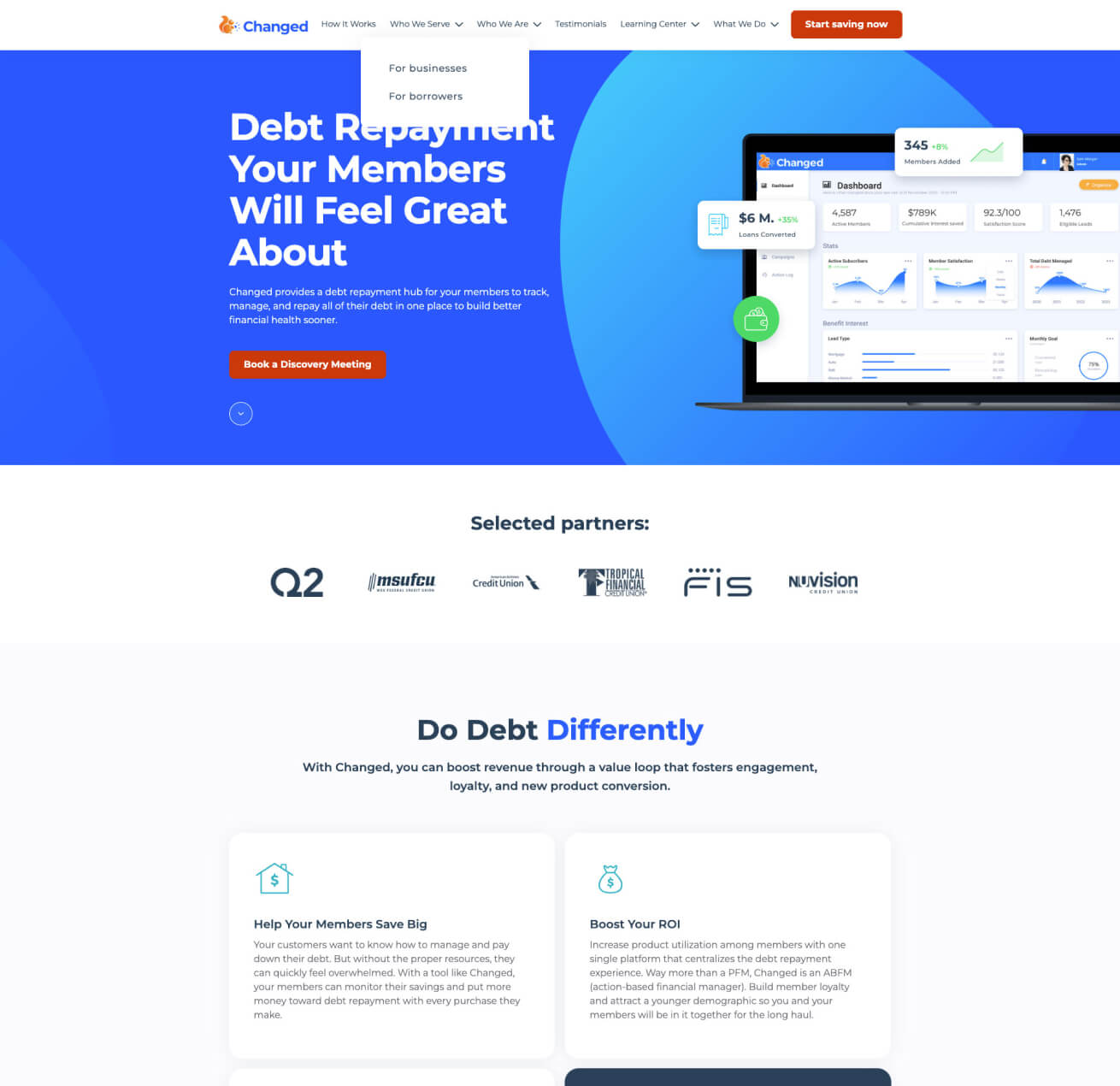
B2B and B2C Navigation
Visitors can now easily find B2B or B2C content, thanks to new, streamlined top bar navigation.
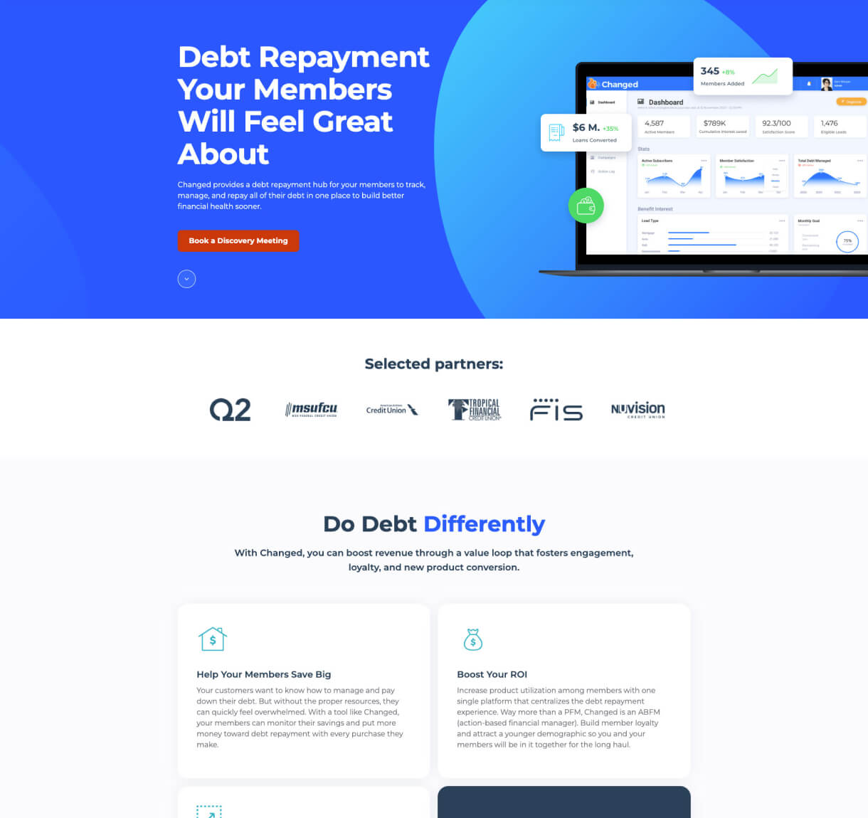
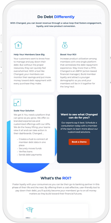
Mobile App Cohesion
This redesign includes color gradient and enhanced logo design to delight users and create cohesion across desktop and mobile platforms.
Success Stories Showcase
Customers share their success stories throughout the site to illustrate the impact of the Changed mobile debt repayment app on individual financial freedom.

