Continental Office
Celebrating a Brand’s True Colors and Solutions with a Focused Refresh
Background
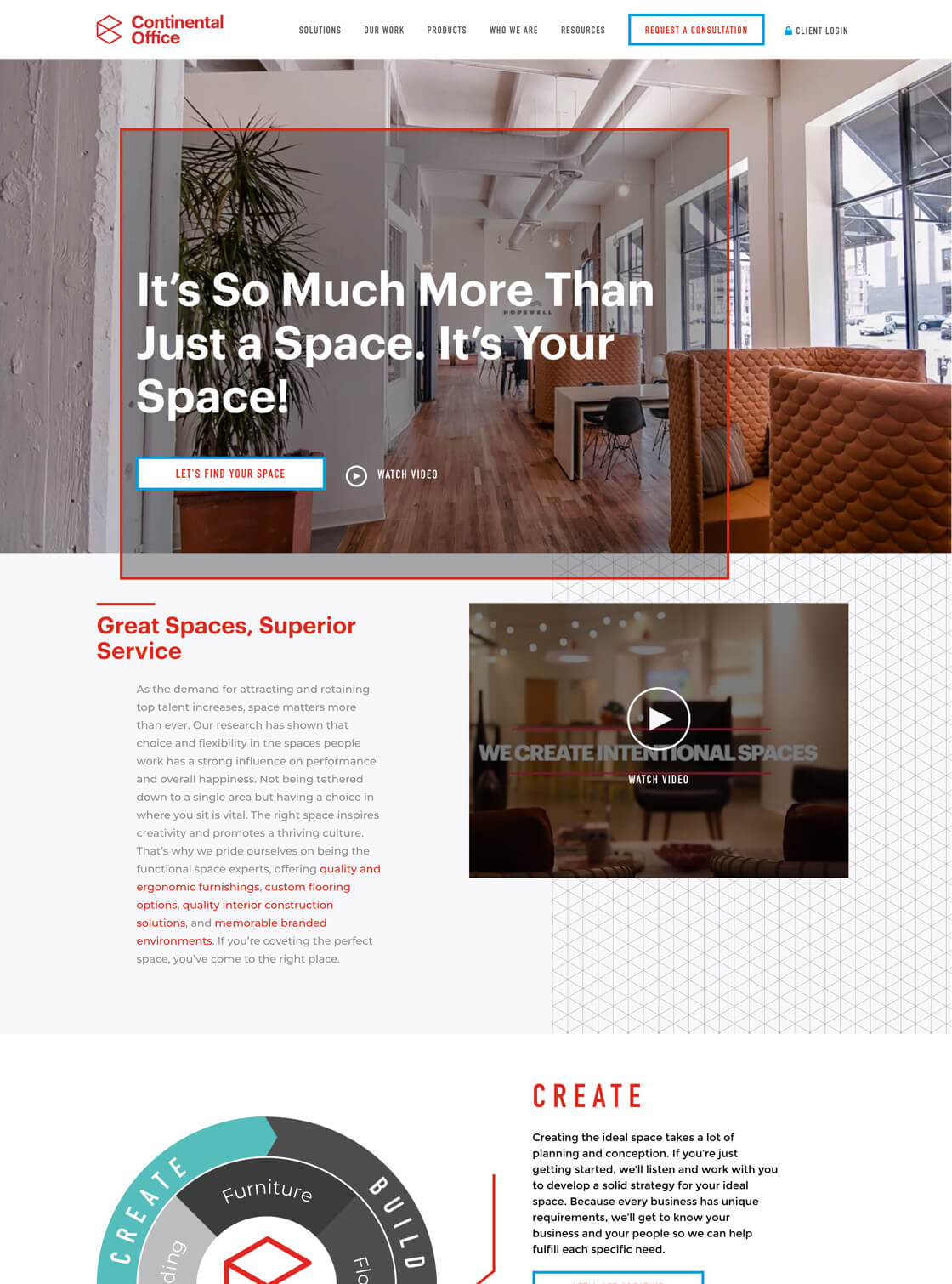
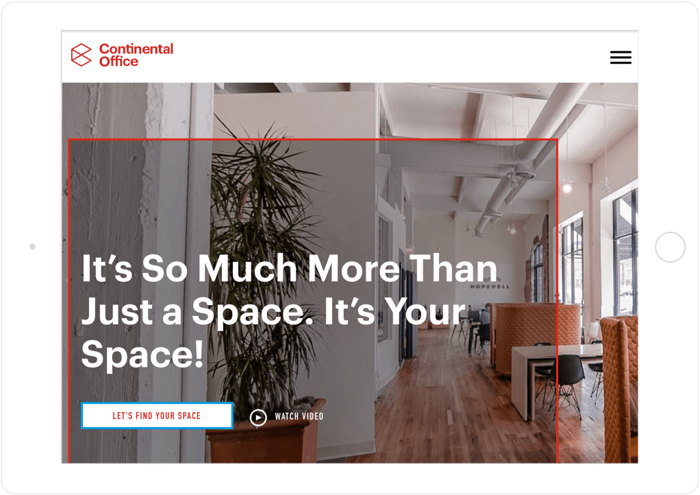
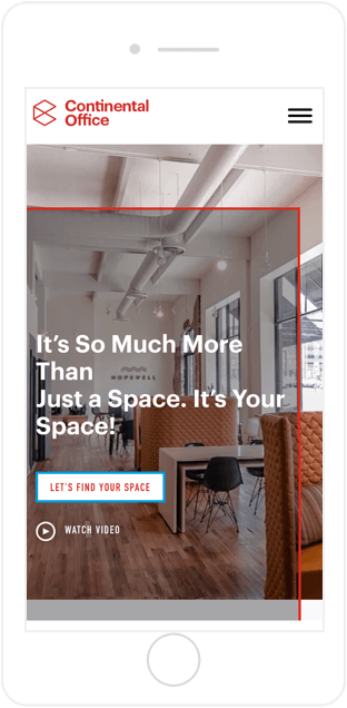
With a team of more than 250 people, Continental Office creates creative, productivity-inducing spaces for businesses, universities, healthcare organizations, and more. From furnishings to floors to custom construction to branding, Continental Office is more than just a furniture dealer—which is why the company came to SmartBug Media® for a website refresh. Continental Office wanted a new website that would bring more customers into the pipeline, increase qualified leads and blog subscribers, and better communicate what it actually does. With the company’s vibrant color palette and stunning portfolio imagery in hand, we created a well-organized website driven by the who, what, why, and how of Continental Office.
Simplifying the Sitemap
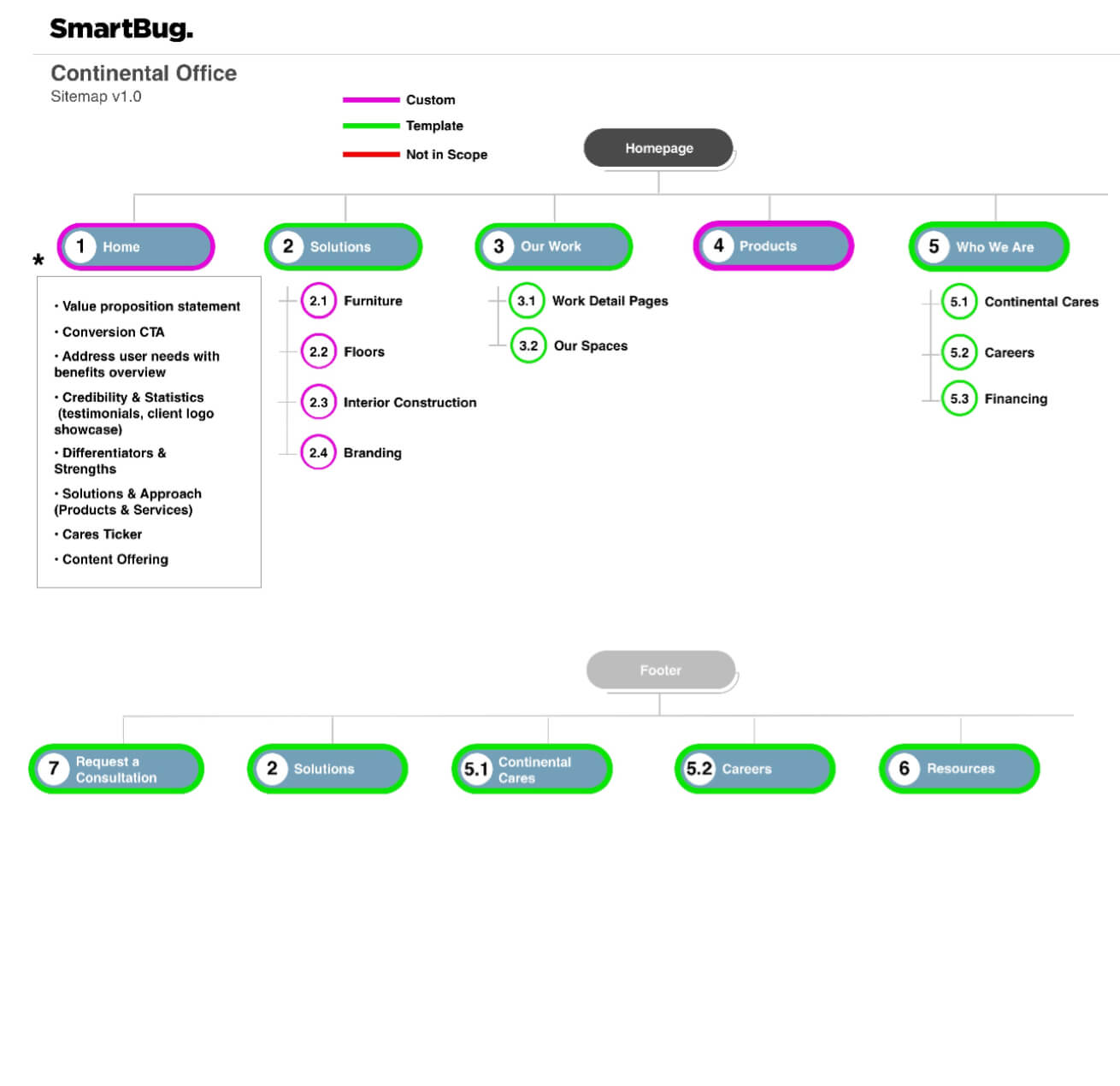
With information architecture in mind, our UX team focused on organizing the client’s website content around its buyer personas, as well as being more digestible and navigable.
Creating Solutions with HubDB
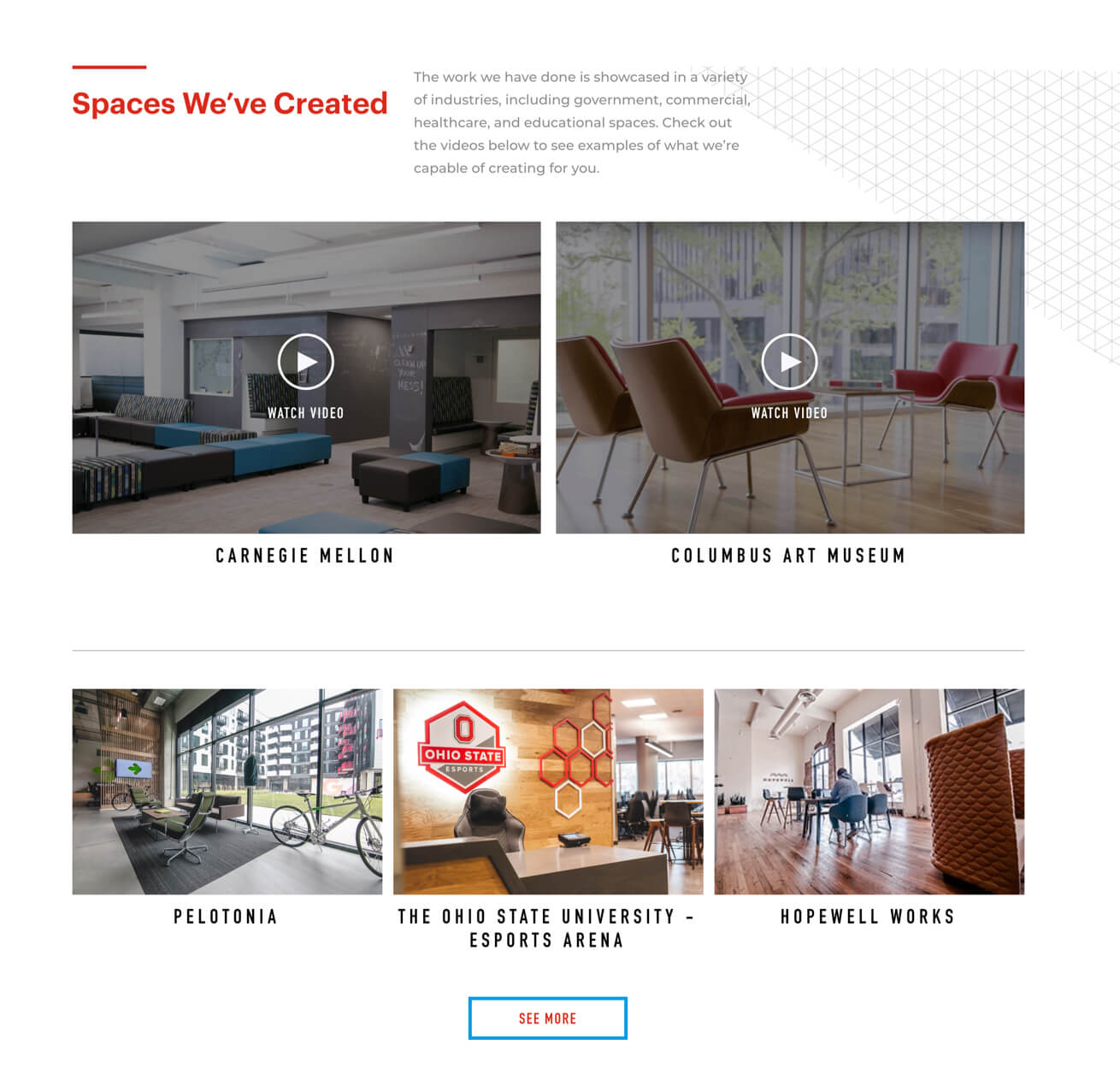
Using HubDB and tagging, we created buyer persona-driven solutions pages that highlight projects and blog articles that are specific to each unique solution the client offers.
Playing with Visual Hierarchy
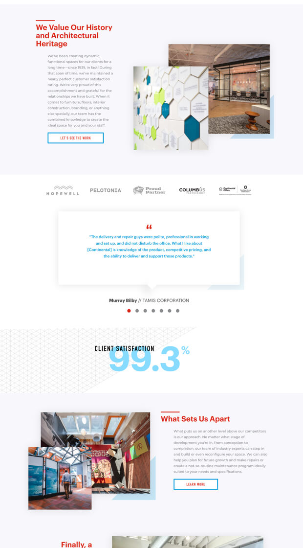
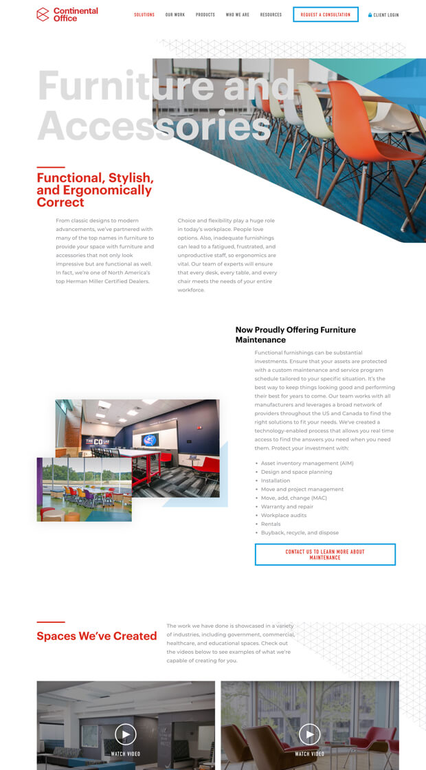
In addition to layering images with complementary graphical elements and drop shadows, we also played with font weights and sizes to move site visitors seamlessly around the website.
Writing to the Brand Voice
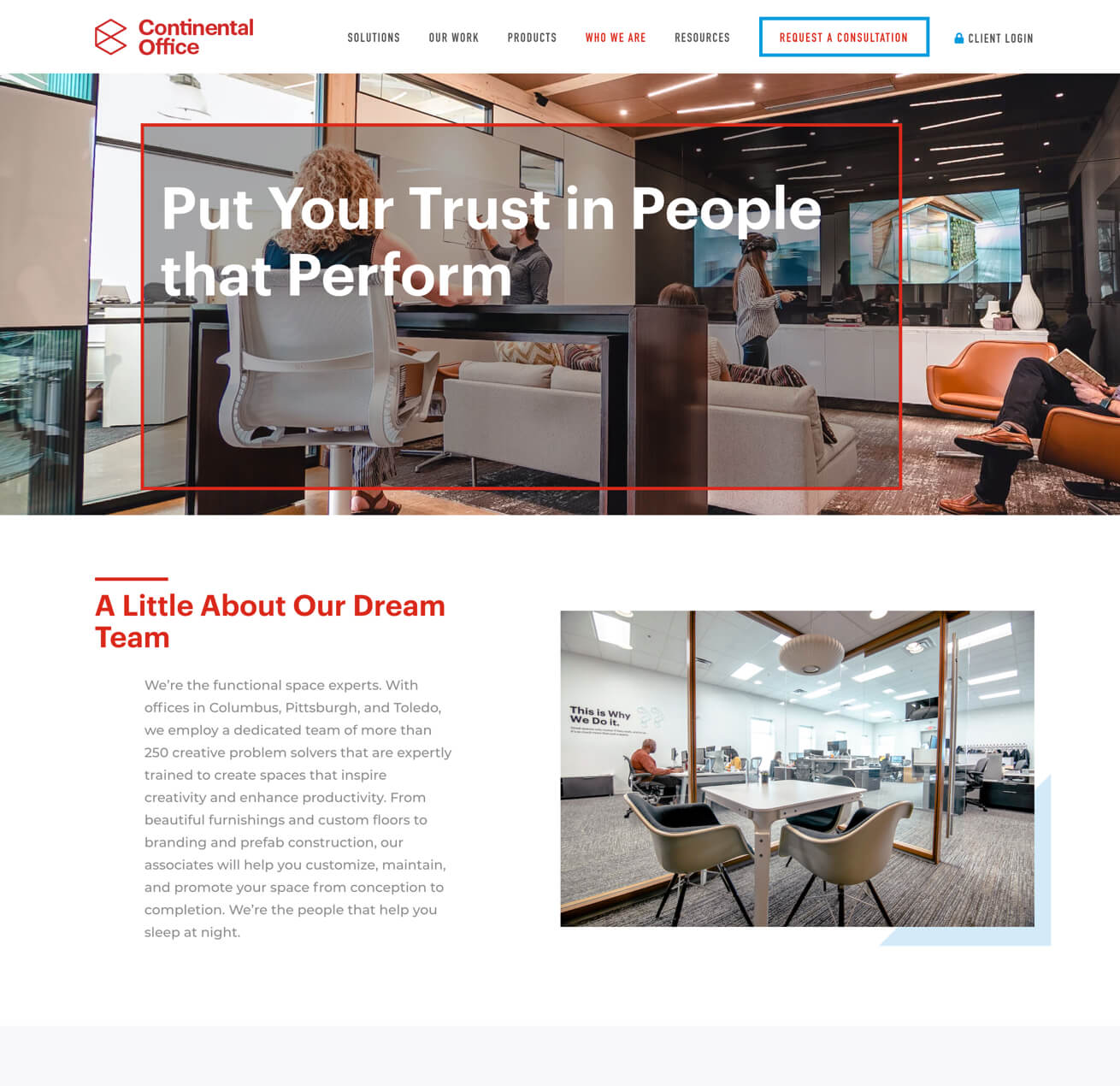
Website copy and design go hand in hand, so our team punched up the copy to make it more conversational and human in order to embody the client’s brand voice and round out the site design.
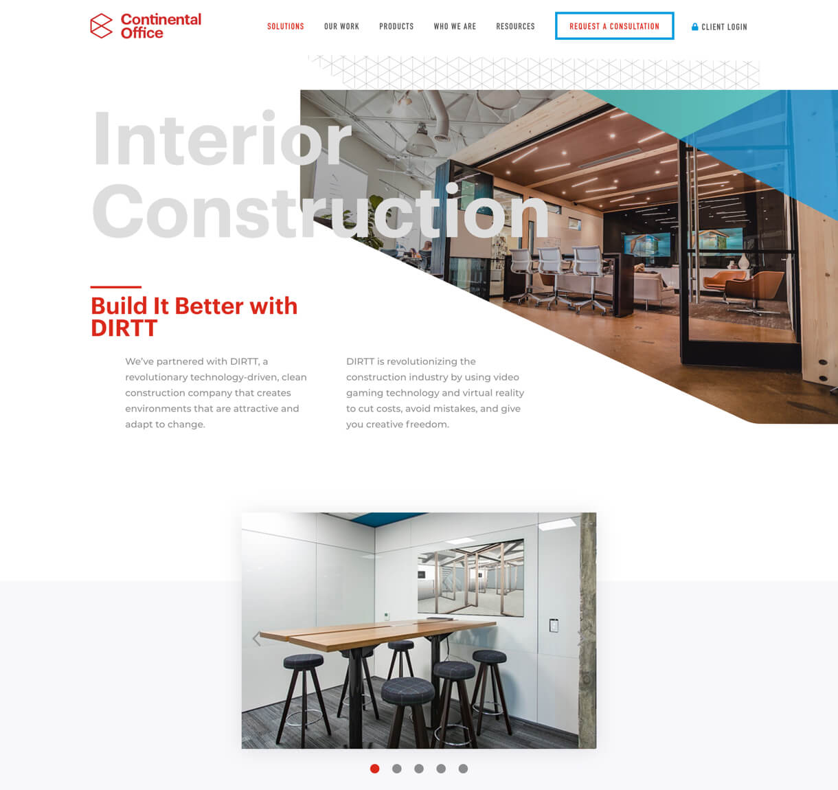
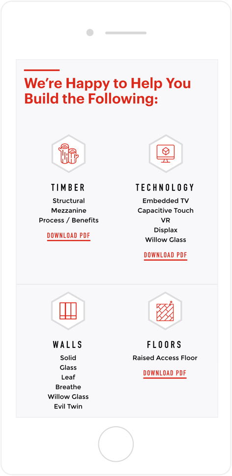
Brightening the Experience
In order to deliver a crisp, clean layout, we designed the site with a focus on white space peppered with pops of color that highlighted the client’s bright brand palette.


