Method Schools
Transforming a Website on a Tight Budget
Background
Method Schools is an online charter school network that provides curricula for grades K-12. The organization’s website was a continual work in progress and a hodgepodge of design styles and functionalities. The site needed to be redesigned to improve UX, optimize lead generation, and incorporate SEO—but Method Schools’ budget to do this was limited. The organization chose SmartBug Media® to economically transform its website and make it functional for users and internal staff alike.
Custom Homepage
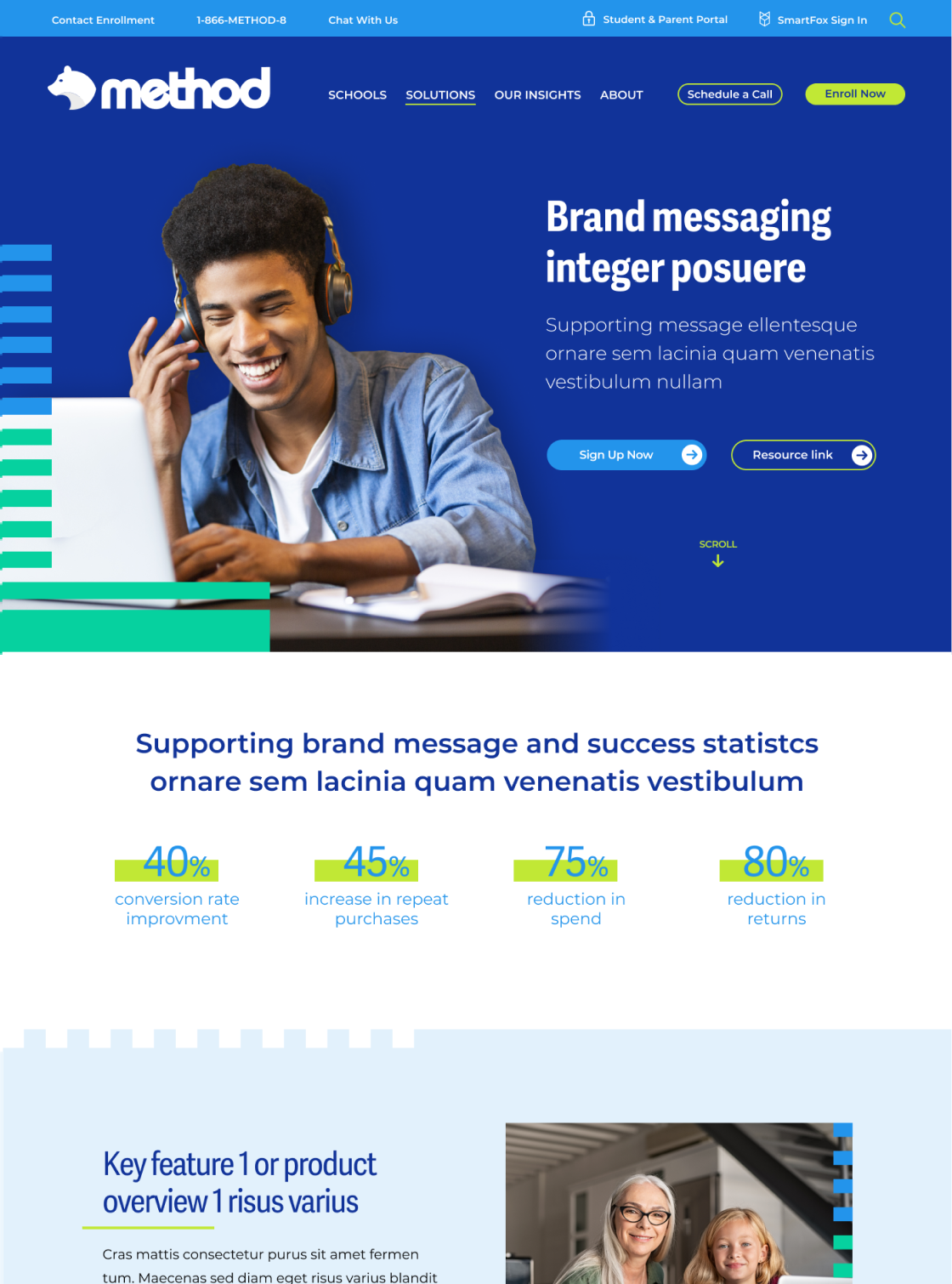
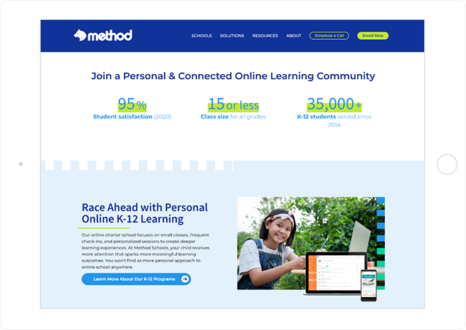
SmartBug designed a custom homepage that set the tone for the rest of the website (for which custom pages weren’t budgeted). We were also working with Method on an inbound marketing retainer, and our discovery process there helped inform the homepage strategy and interior pages.
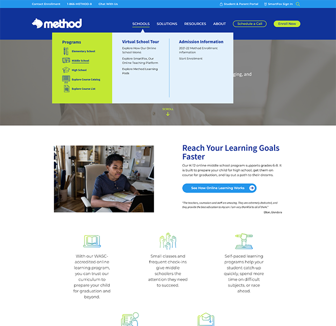
Better Navigation with a Mega Menu
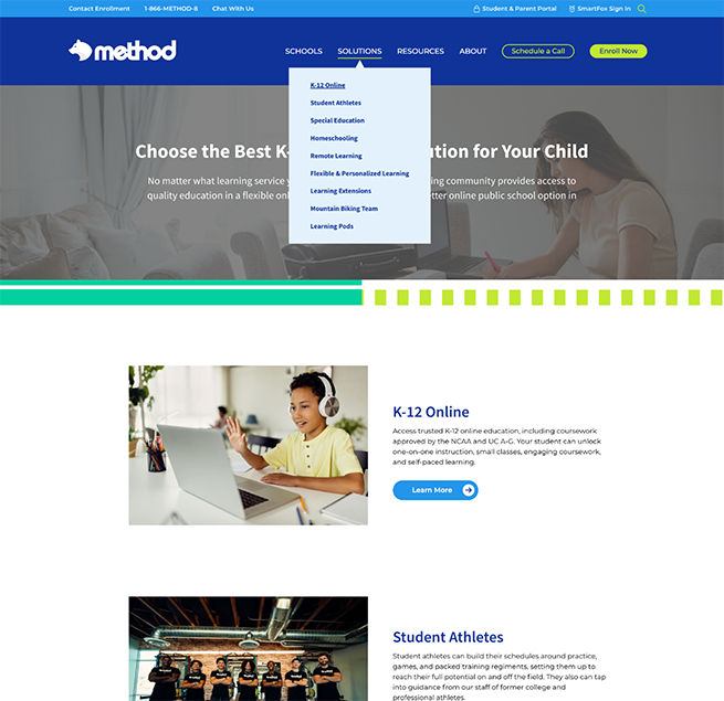
Streamlined top-of-page navigation gives visitors an array of options to find the information they need without overwhelming them.
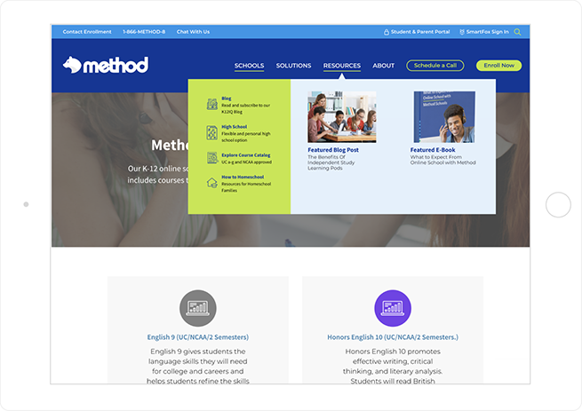
Course Catalog Functionality
SmartBug had already created an online course catalog for SmartFox, a subsidiary of Method Schools, and adapted it to the updated Method website.
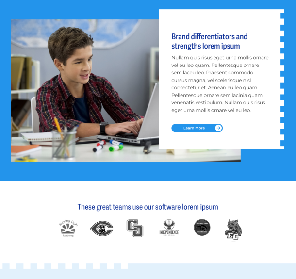
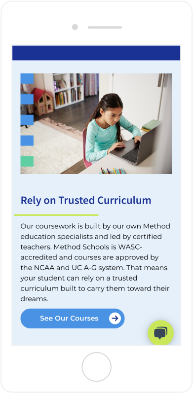
A Brand Look That Appeals to the Audience
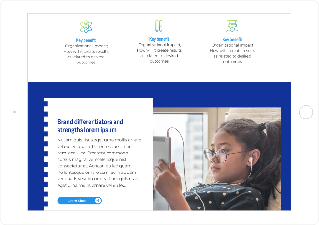
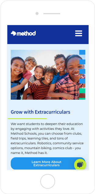
The brand design—including a “notebook” look—emphasizes learning and stands out to website visitors. Bright colors also push the messaging that Method Schools has something vibrant and fun to offer.
Filling the Gaps in the User Journey
Method’s original website didn’t have a good information architecture and failed to align with personas. The new site, particularly the solution pages, fixes the gaps in the user journey and addresses specific persona pain points.

