Move Smartly
Educating Readers on Smarter Real Estate
Background
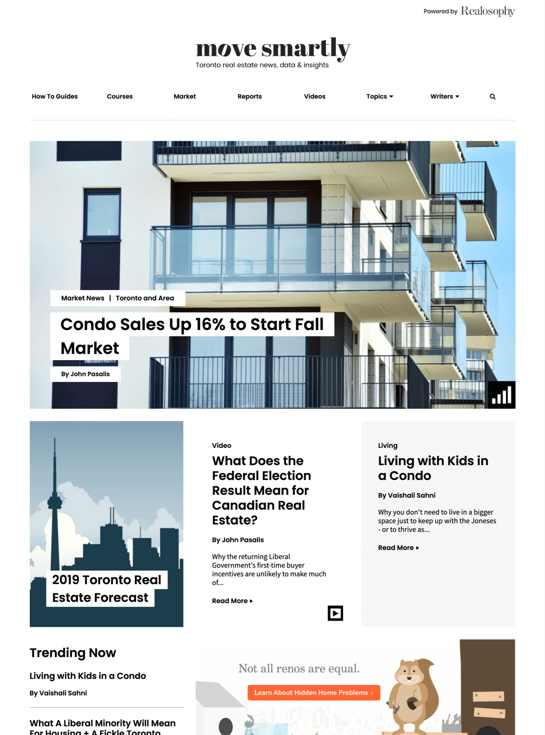
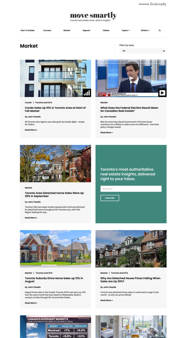
Move Smartly is a blog website that helps consumers make better real estate decisions. Focused on the greater Toronto area, Move Smartly provides a trusted source of thought leadership content through articles, reports, and guides. Besides the website design, SmartBug Media® created the Move Smartly logo—a design which aligns with the brand qualities of its parent site, Realosophy. Unlike typical blogs, Move Smartly’s clean and minimalistic site includes various-sized content containers, thus creating interest on the main page while showcasing various types of content.
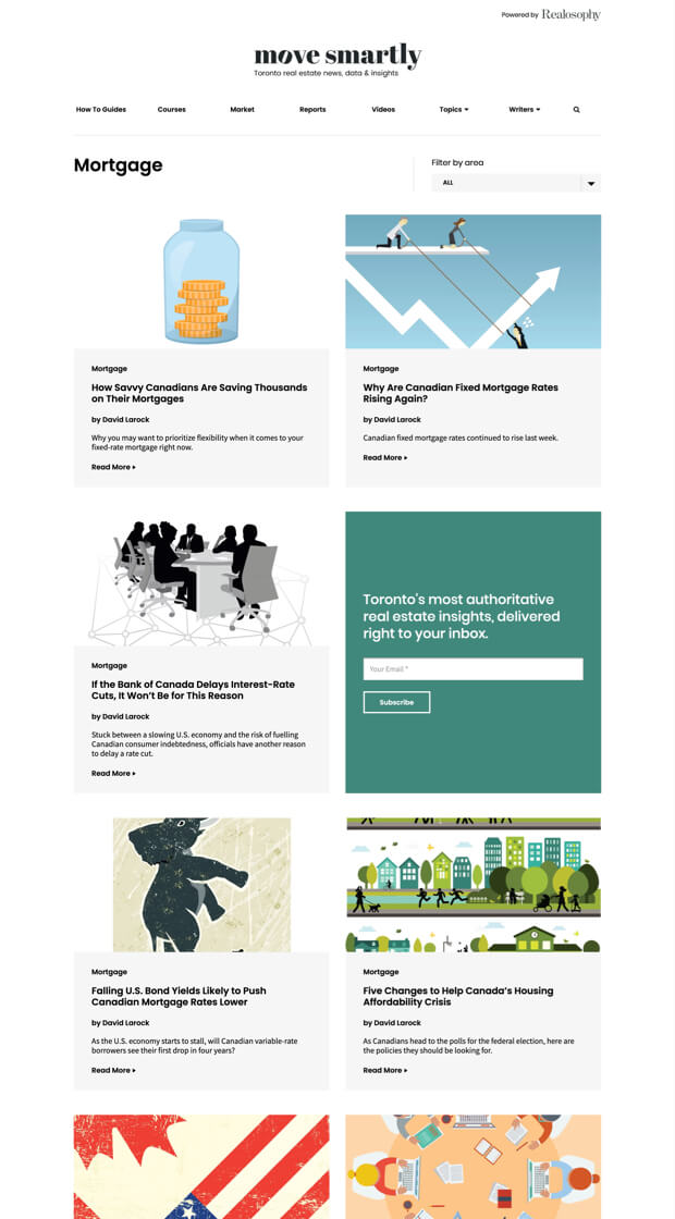
A Unique Look
We combined existing content (in reorganized categories) with a restructured user interface design and layout to create a better blog architecture.
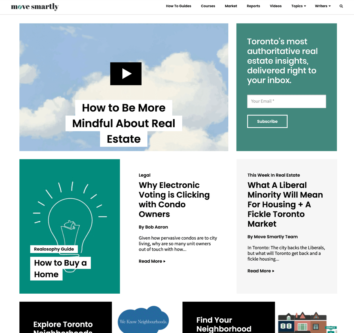
Creating a Homepage
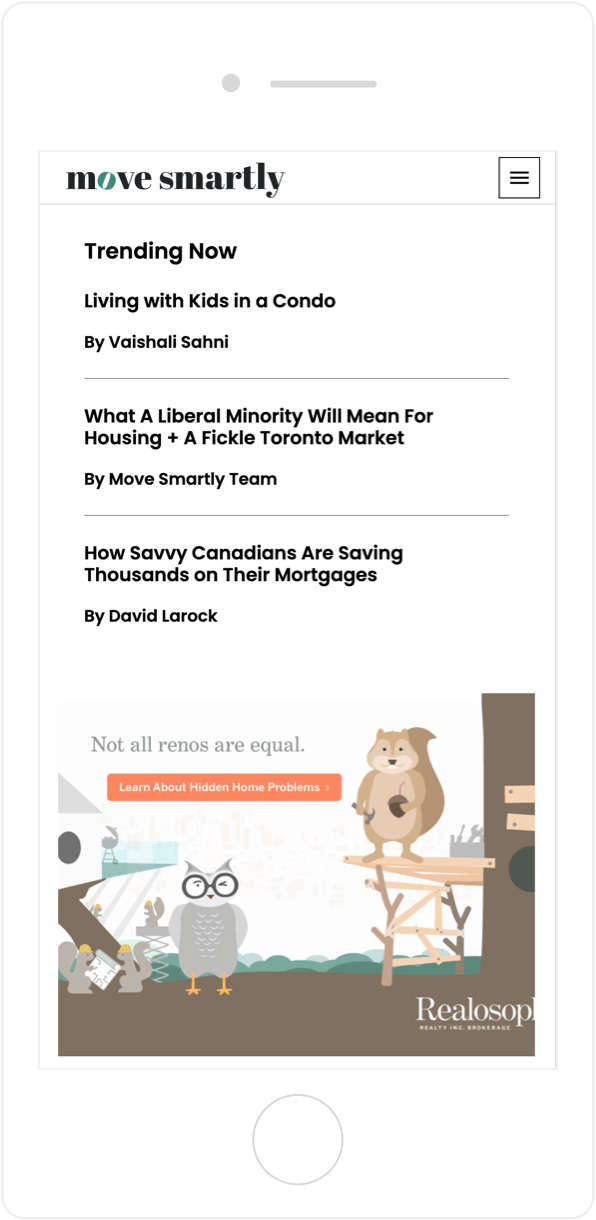
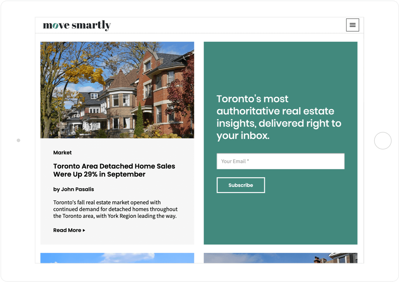
The newly added homepage uses a magazine-style layout that emphasizes visual elements and typography and carefully balances negative space and full-bleed imagery.
Designed for Easy Updates
The homepage was built to be easily updated and always look good—even if the person updating it isn’t familiar with basic design principles.
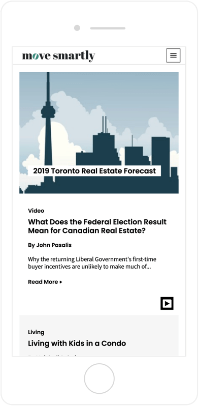
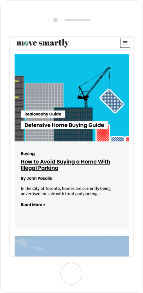
Mobile and Marvelous
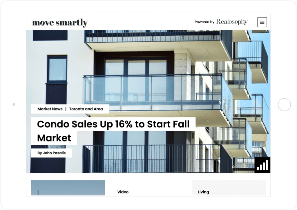
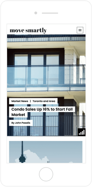
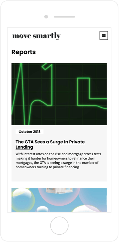
The mobile layout is responsive and stays true to the original intent to turn Move Smartly into a magazine-style digital publication.
Looking the Part
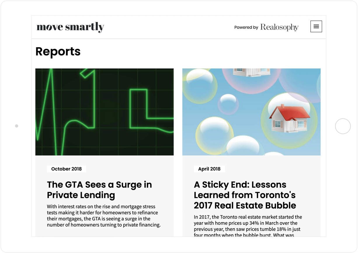
The visual categories at the top of the page look less like a blog and more like an expensive real estate website focusing on a variety of authoritative topics.


