MyComplianceOffice
Knowing Your Risks Requires the Right View
Background
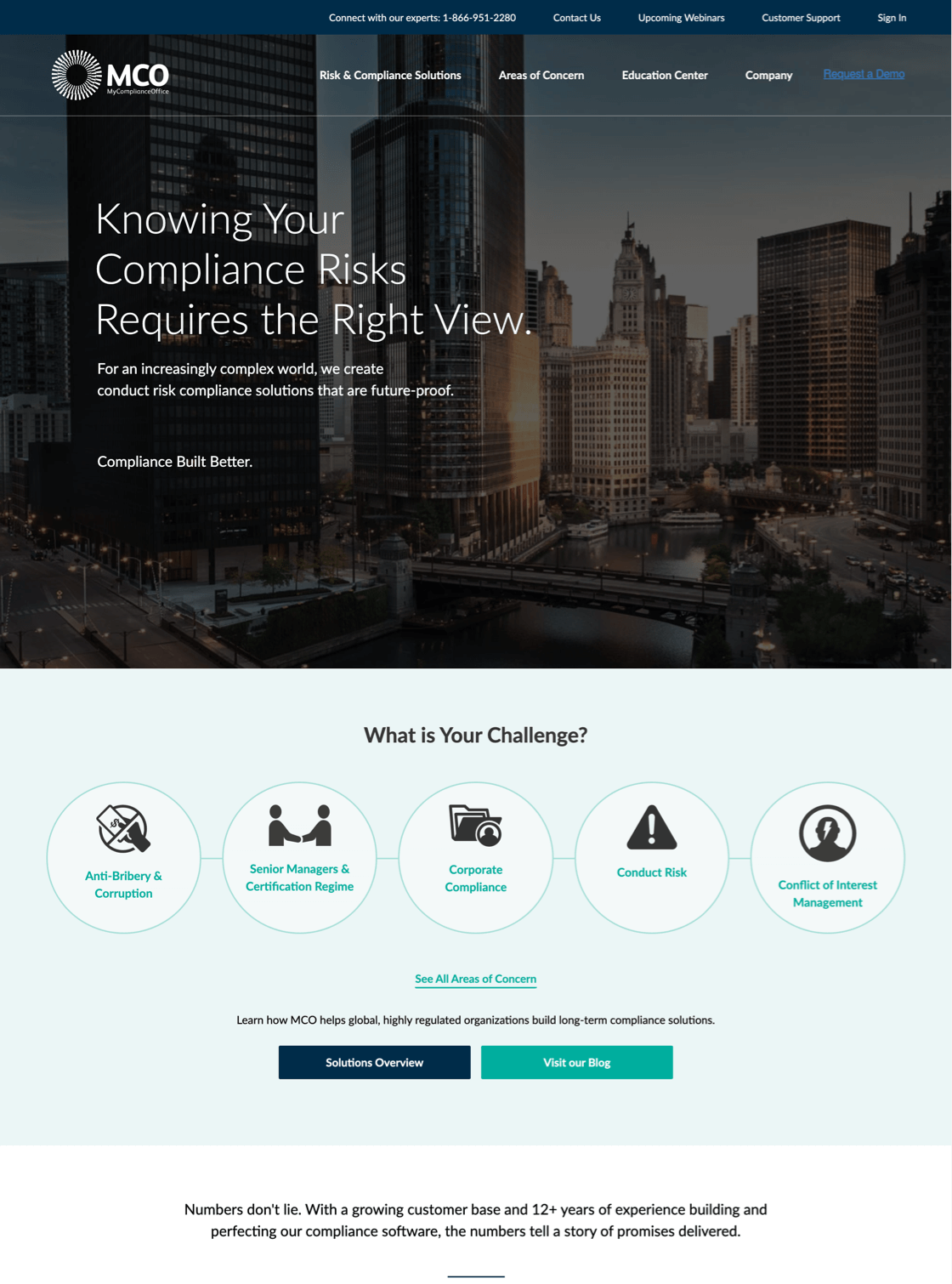
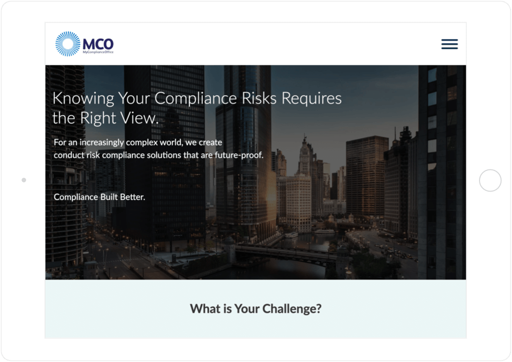
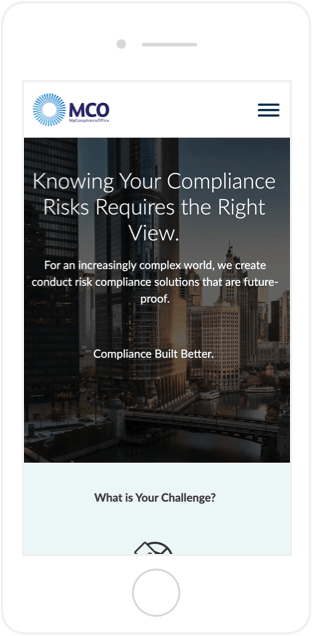
MyComplianceOffice (MCO) provides SaaS compliance management software that enables companies around the world to reduce their risk of misconduct. With its singular focus on conduct risk, MCO has developed a fully integrated solution that helps clients of all sizes easily and affordably comply with confidence. MCO was looking for a website redesign and, more importantly, a re-architecture of its website. SmartBug Media™ dove deep into MCO’s data and information, including personas, goals, audits, and competitor analysis, to develop a new information architecture to meet MCO's growing needs. From this baseline, SmartBug was ultimately able to redesign the site with a professional look that meets customers’ growing expectations.
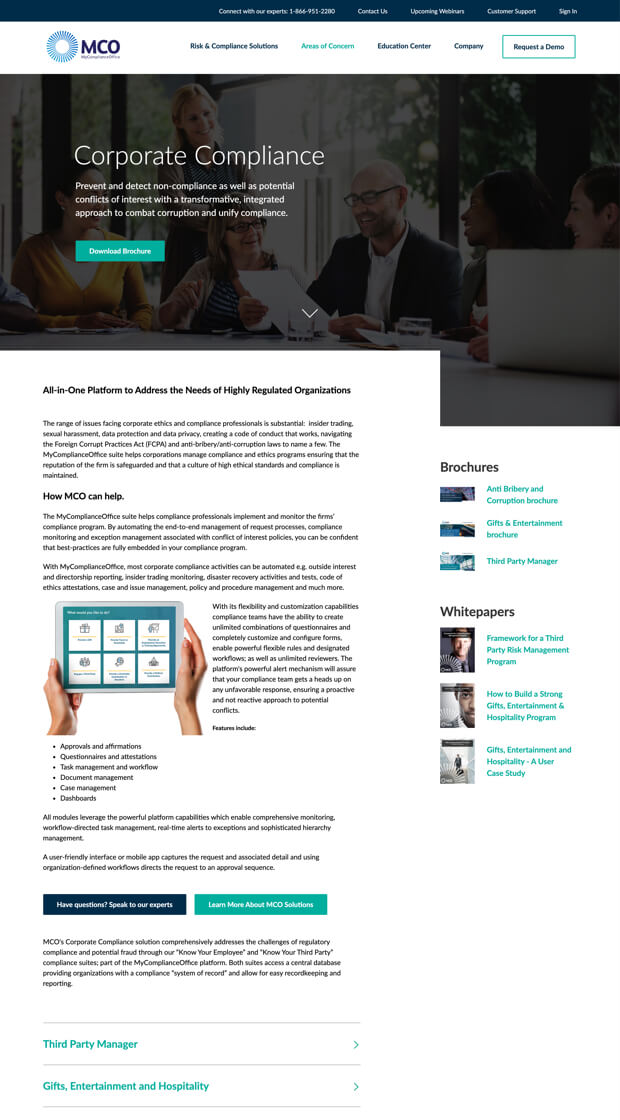
Speaking to All Visitors
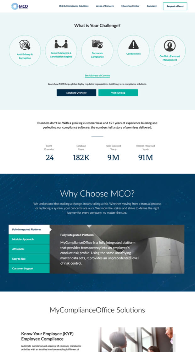
A dual content architecture serves visitors at various stages of the Buyer’s Journey, helping guide them no matter their level of compliance understanding.
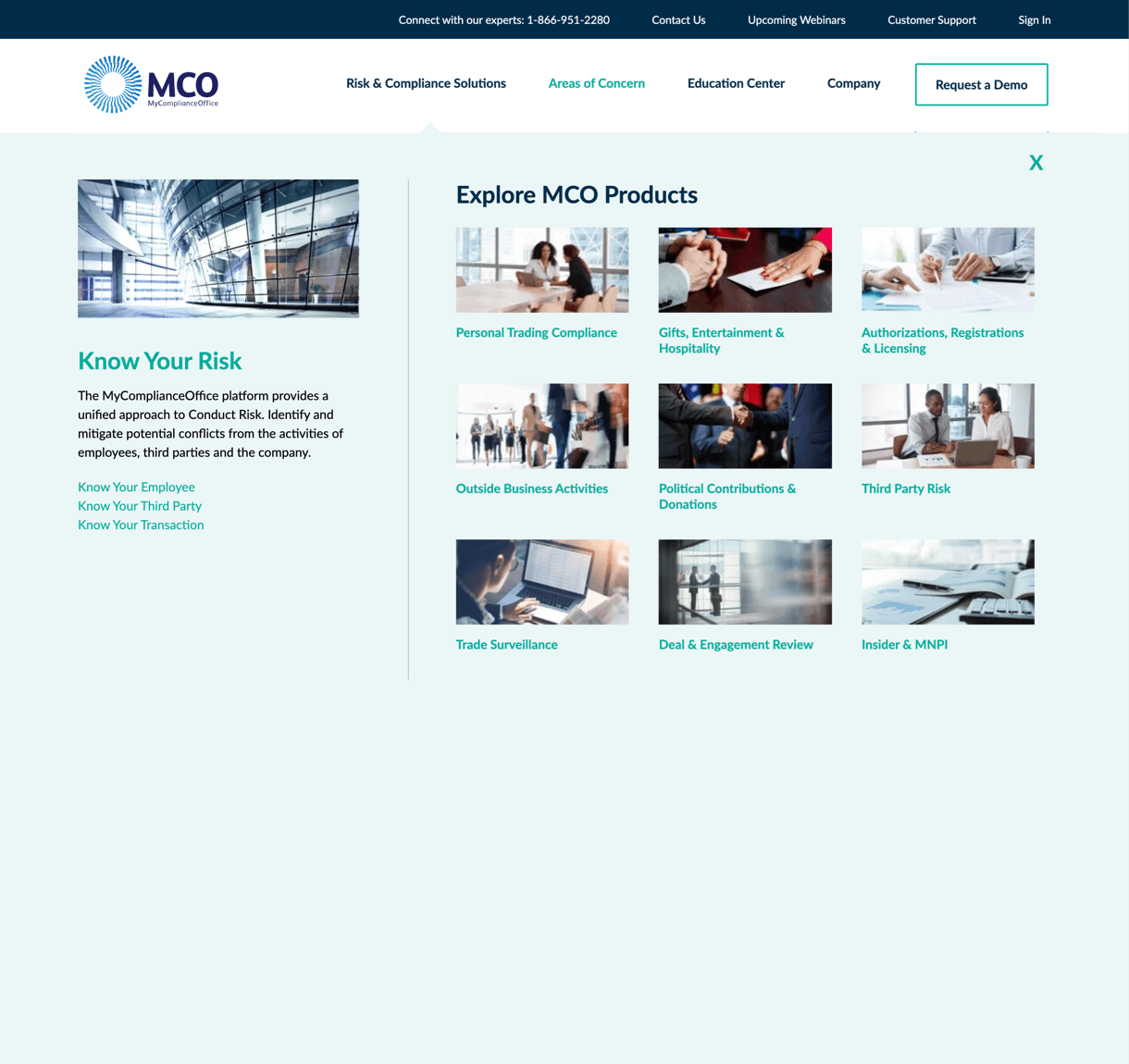
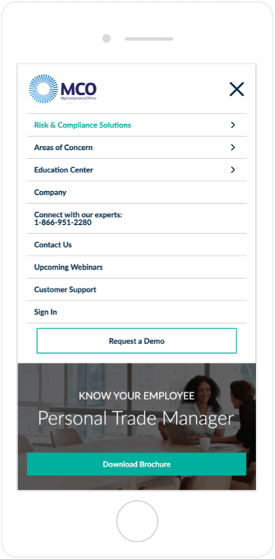
Using the Research
We created a detailed comparative industry review with contextual insights and recommendations. This data was key to building an industry best-in-class website.

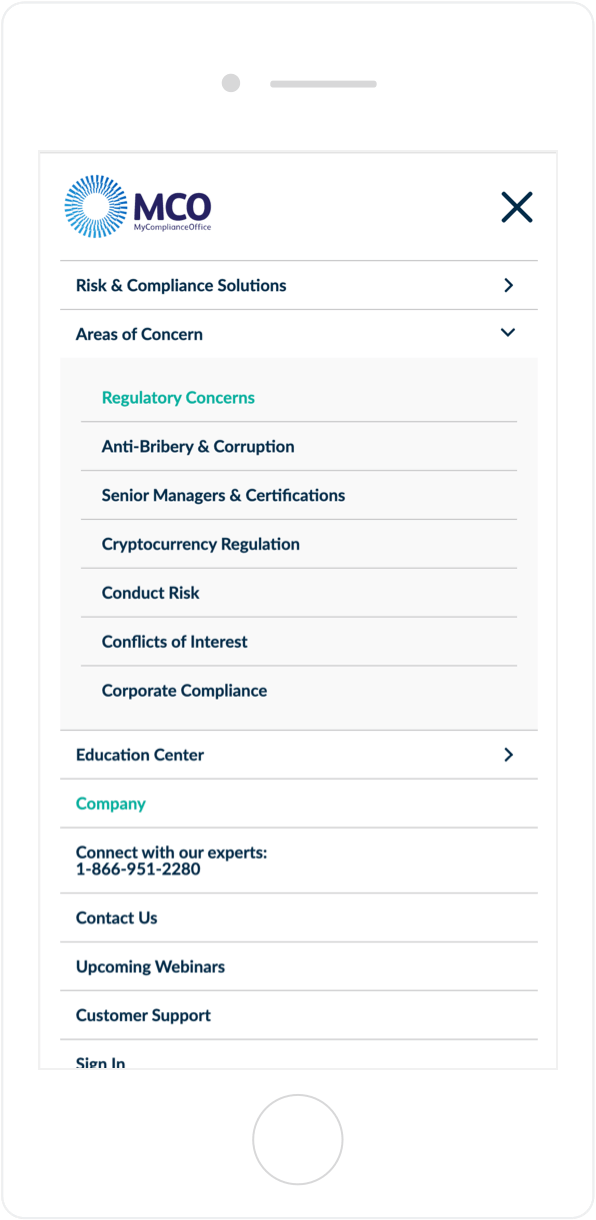
Relating to Prospects
Our analytics review and UX recommendations led to a site architecture that makes MCO relatable to prospective customers and encourages conversions.
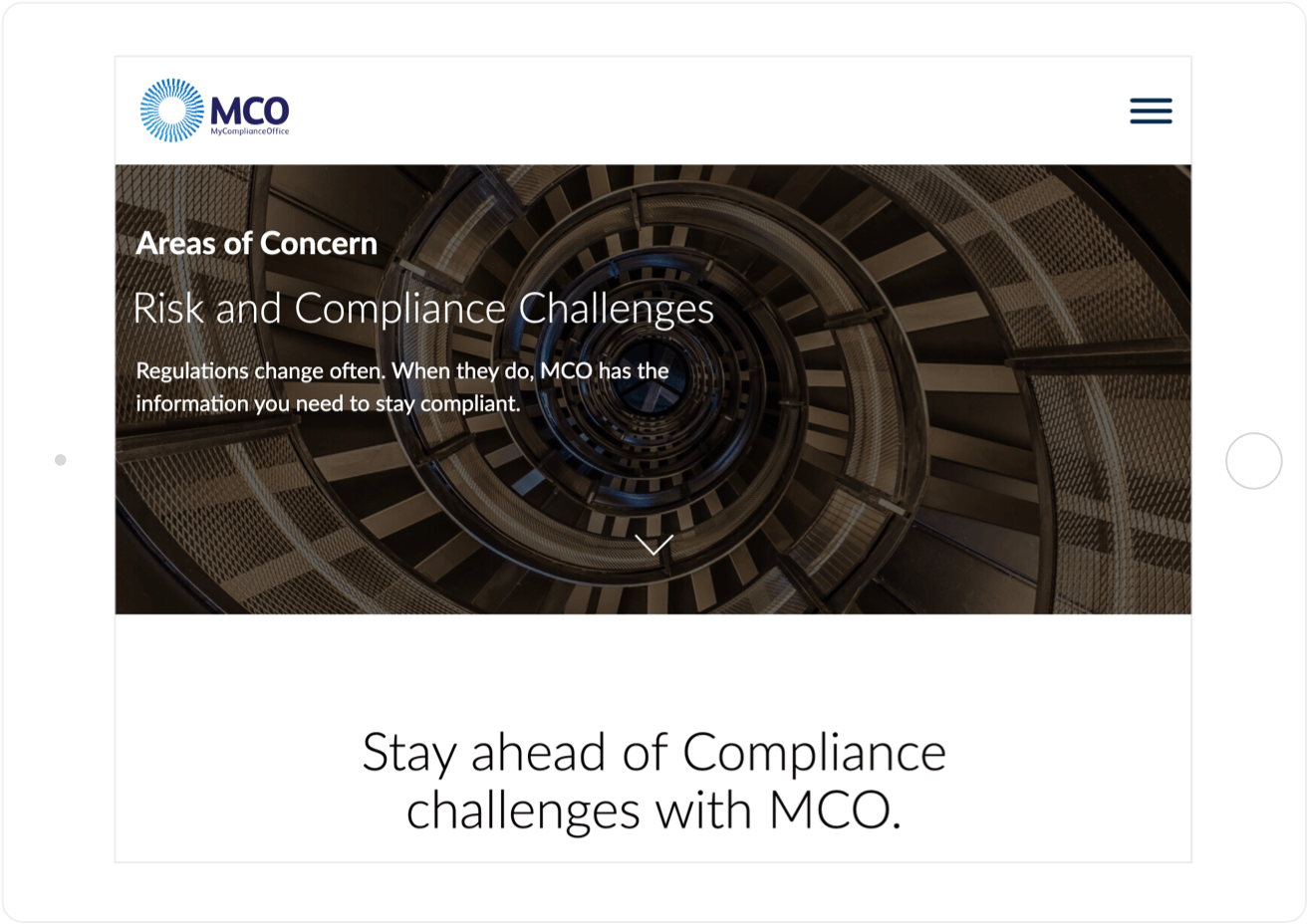
The Look of Compliance
The website uses images to reflect MCO’s global presence and the pivotal and structural nature of the logo mark.
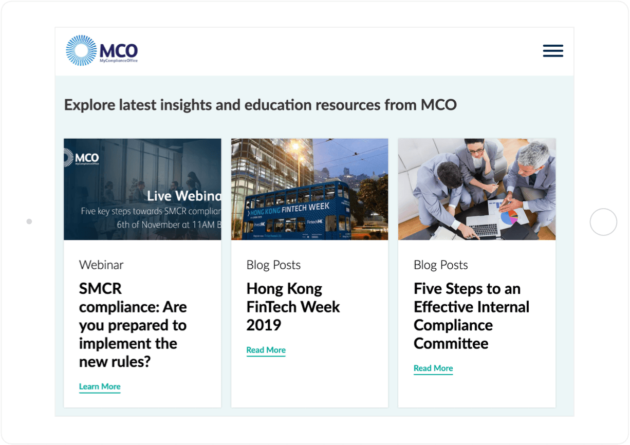
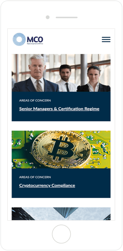
Perfecting the Palette
We refined the website’s color palette, using a muted dark blue for strength and replacing cyan with teal for greater contrast and readability.

