Skild
A Fun New Look for the Leader in Innovative Challenges


Background
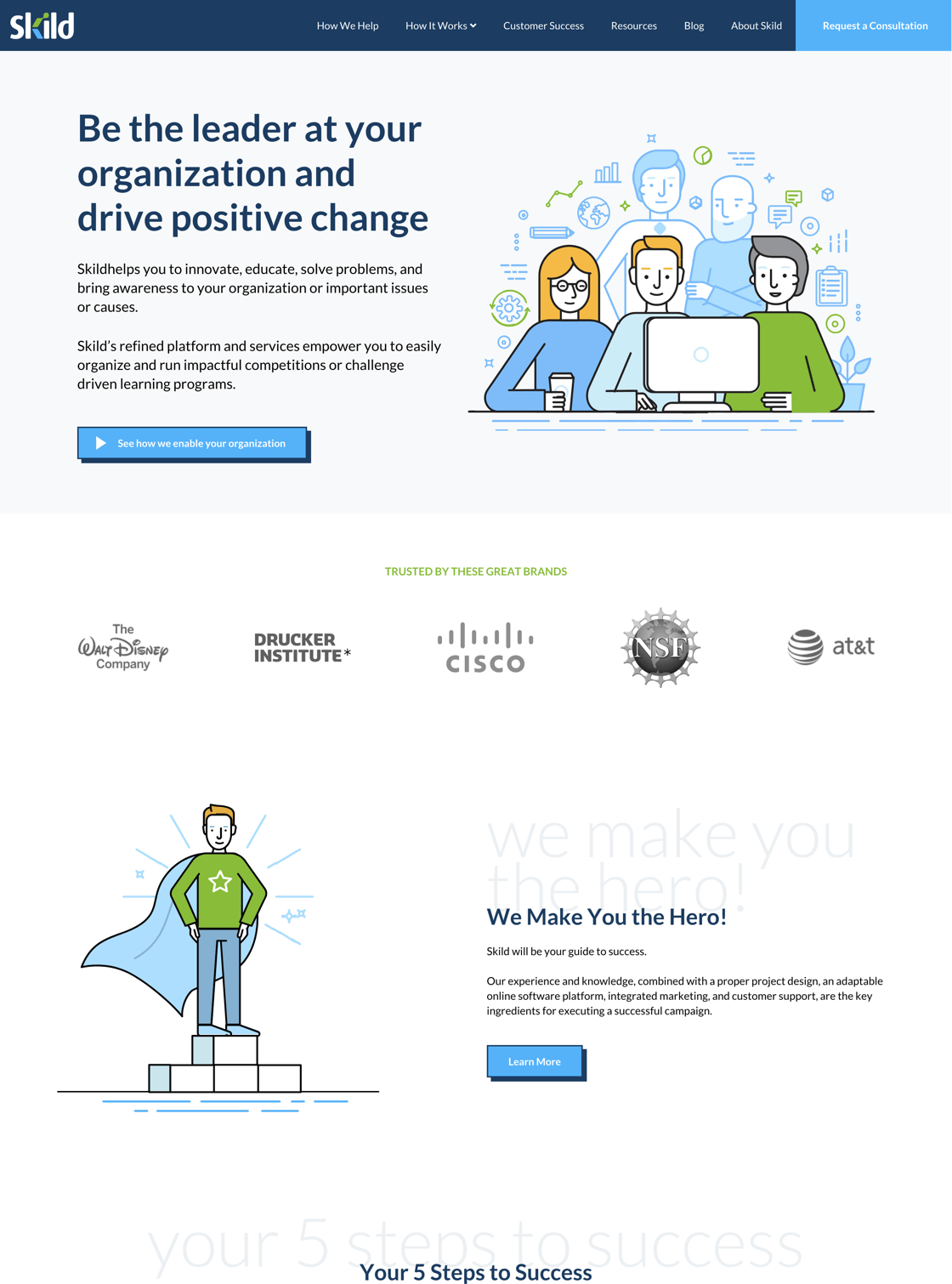
Skild is the leader in crafting and running innovation challenges, providing consulting and best practices backed up by years of experience. Skild offers a refined platform to empower organizations to easily run impactful competitions or challenges that drive learning programs. Skild came to SmartBug looking to expand by engaging customers who want to use all of its services. The new website better explains Skild as a thought leader with services—as opposed to just a platform. The site is also much easier to edit than previously, thus lowering bounce rate and solidifying SEO. The site is modern, clean, and vibrant, and has fun, comic-style graphics that better portray the Skild brand for learning and educating.
Highlighting the Message
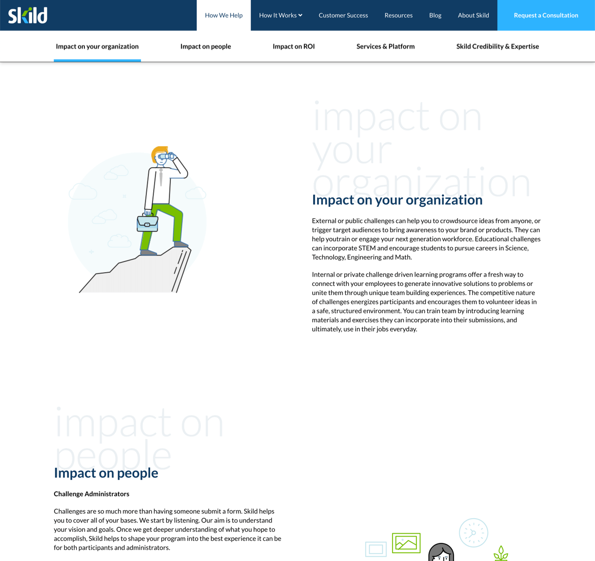
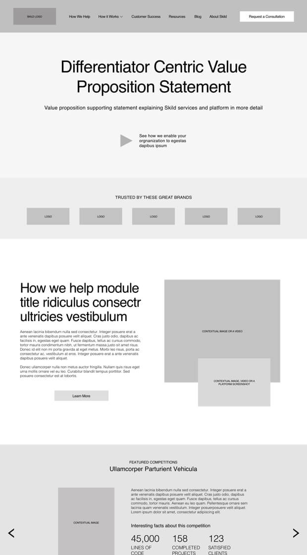
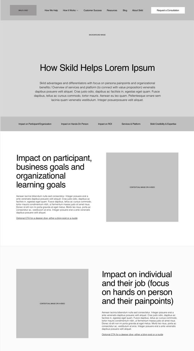
We developed an impact messaging page expressing the “How We Help” narrative that emphasizes what matters most to Skild and its customers.
A New Value Proposition
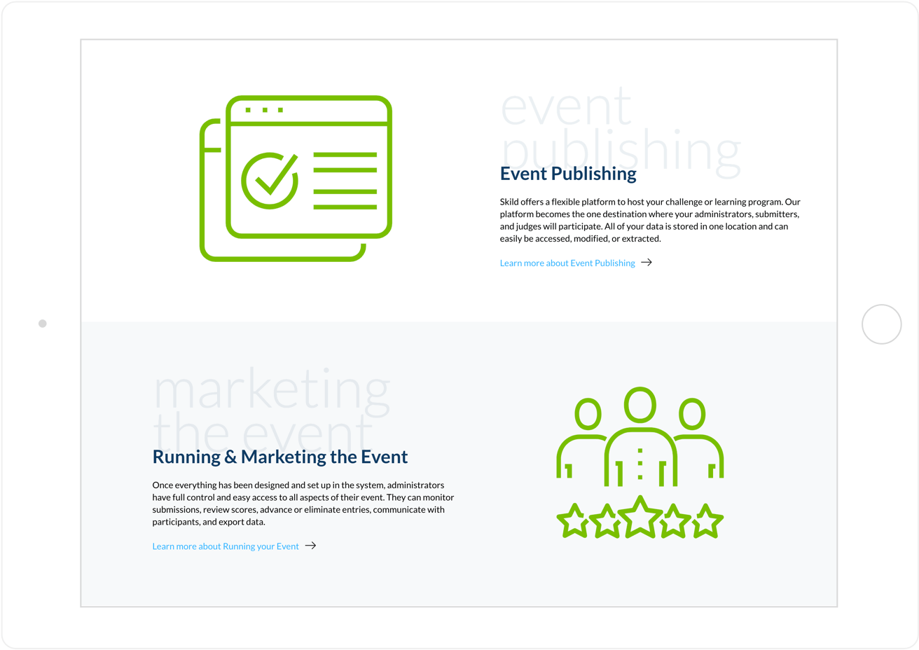
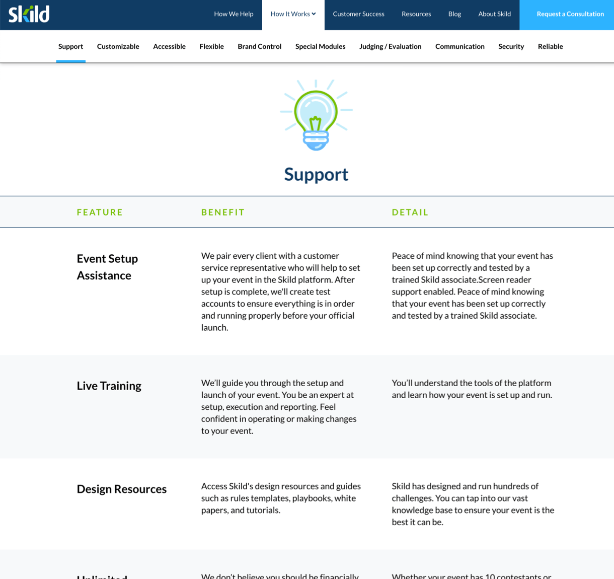
The new “How It Works” section defines Skild’s evolving value proposition as a service-driven company that helps customers use the platform to its full potential.
Researching Personas
Through UX research, we created actionable personas and a content strategy that authentically represents the brand while speaking to the customer’s mindset.

Engaging Imagery
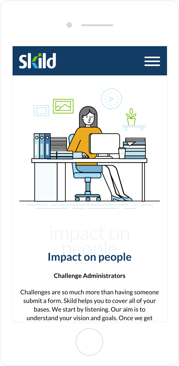
Instead of stock photos, the website uses whimsical illustrations of people working together. This also helps carry the brand color palette throughout the site.
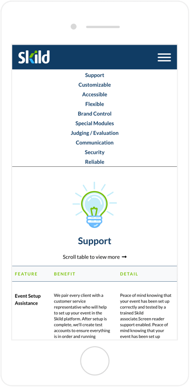
Navigating the User Experience
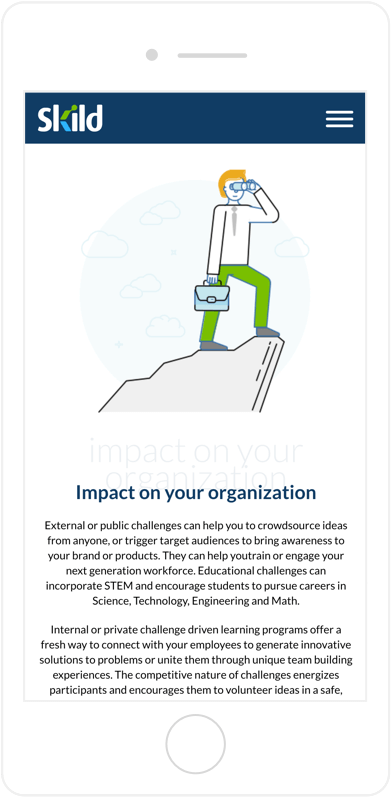
We implemented secondary/anchor navigation for easier access to key points and to minimize scrolling. This strategy is especially helpful on mobile.

