Talemetry
Refreshing a Website Leads to Refreshing Results
Background
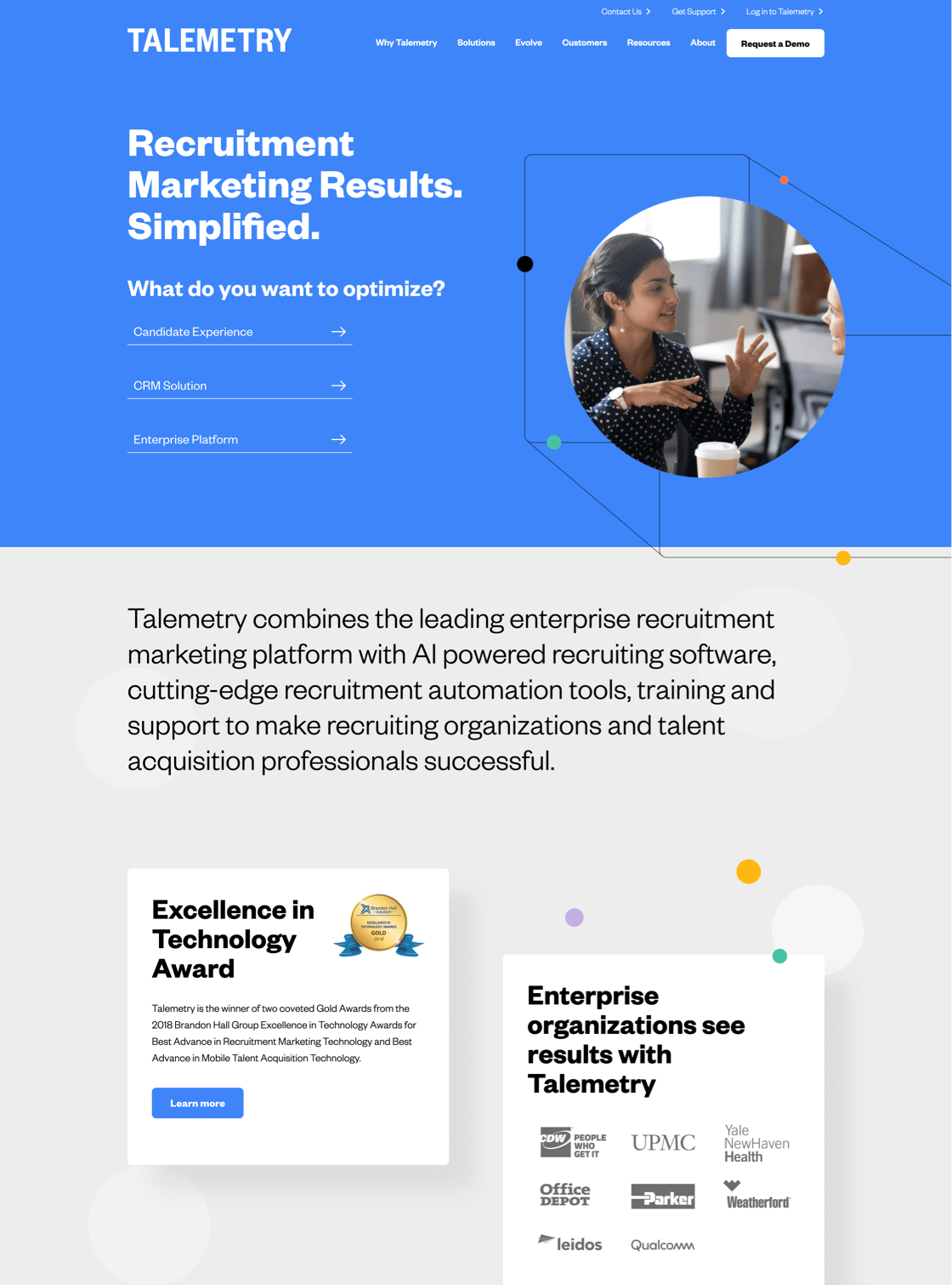
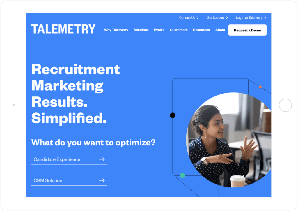
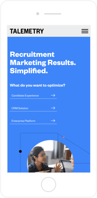
Talemetry is a leader in the results-driven recruitment marketing space, combining the leading enterprise-grade recruitment marketing platform with cutting-edge tools, training, and support to make recruitment organizations and professionals successful. The Talemetry team wanted to greatly increase the conversion rate of its website, increase visitor engagement, and position their company as the thought leader in the recruitment marketing arena. With an aggressive two-month goal of relaunching the website for an annual industry conference, SmartBug Media® was able to modernize and refresh the site, making it easier for visitors to quickly understand how Talemetry can help them. We also created custom animation videos to illustrate features and tell the Talemetry story.
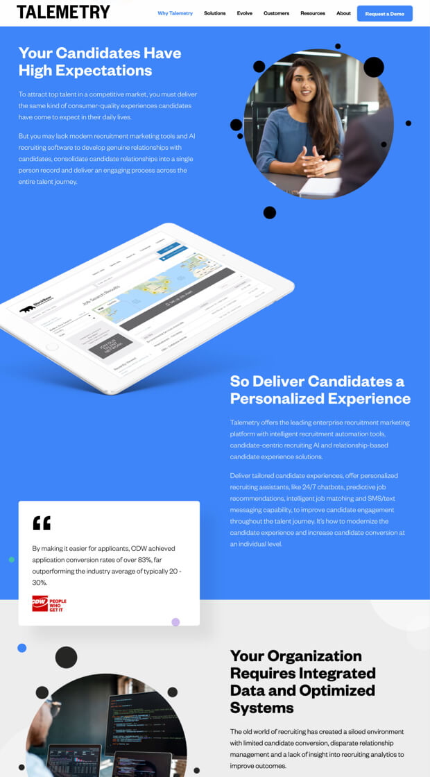
Massaging the Messaging
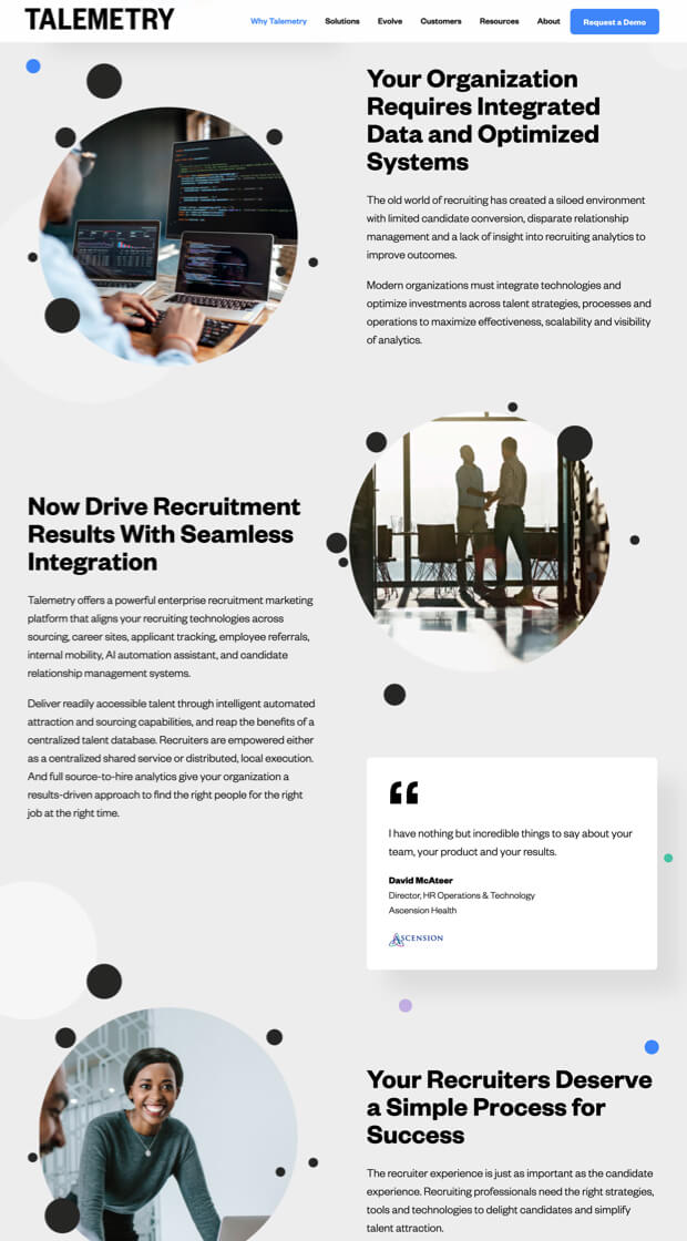
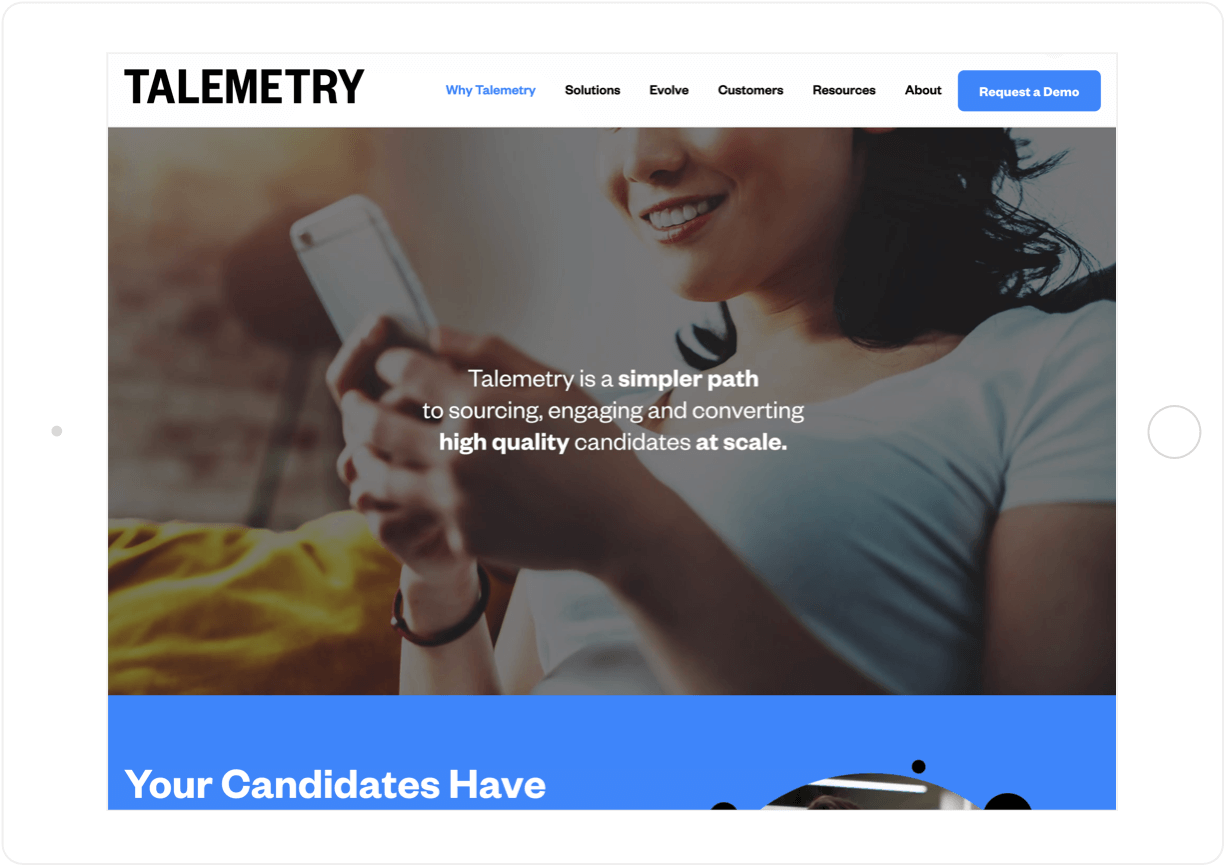
The new UX expresses Talemetry’s new corporate messaging. The "Why Talemetry" page educates prospects about what they can expect from a contemporary recruiting tool.
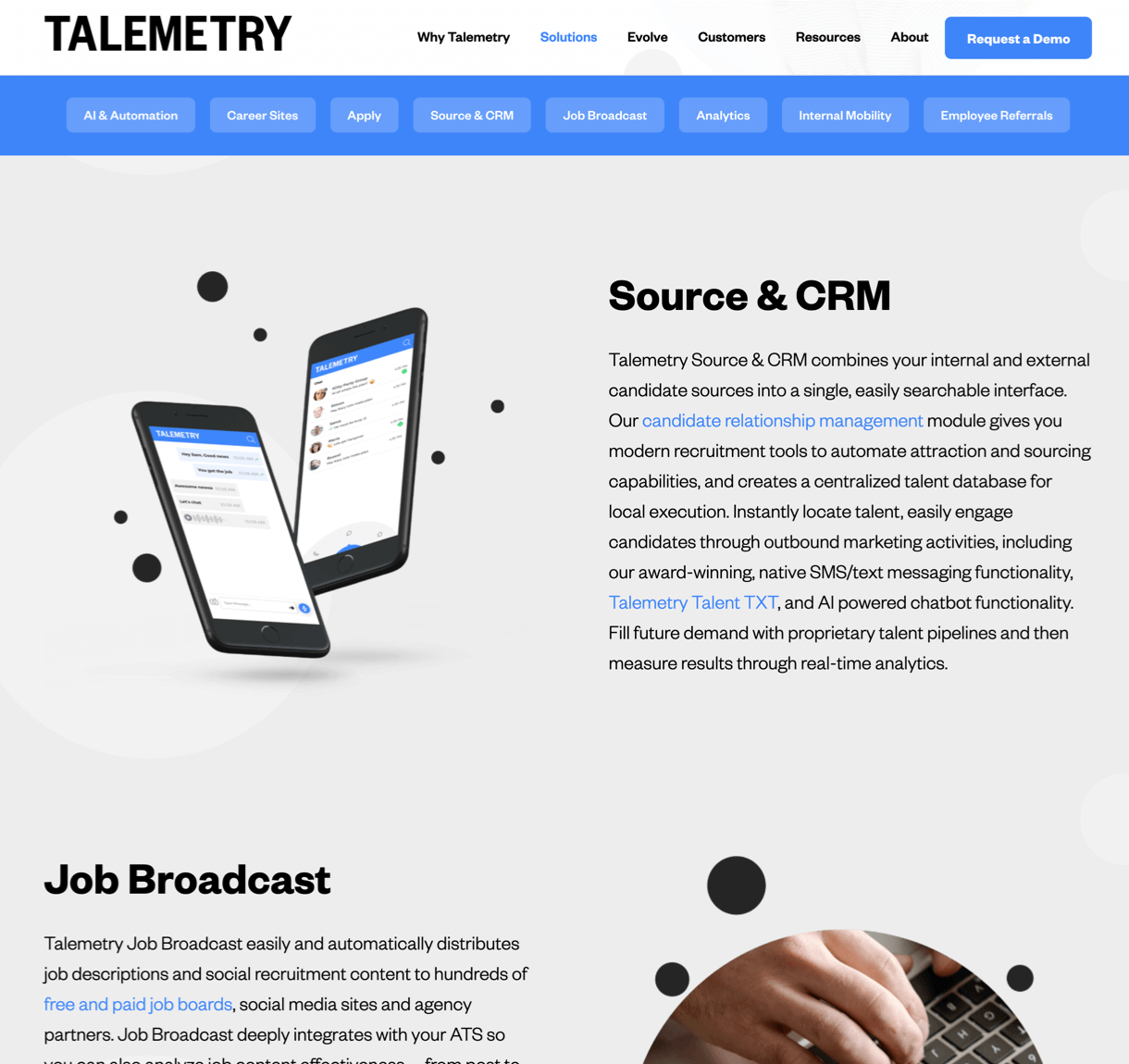

Insightful Research
The website narrative addresses core persona needs in the context of brand differentiators based on UX goals developed through persona and brand research.
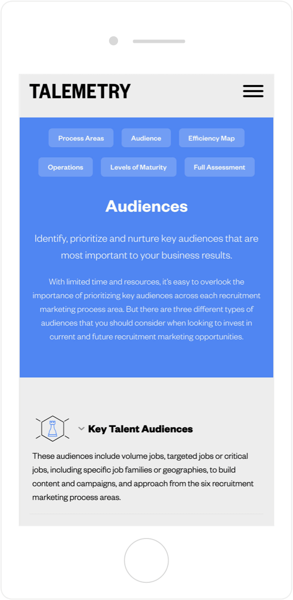
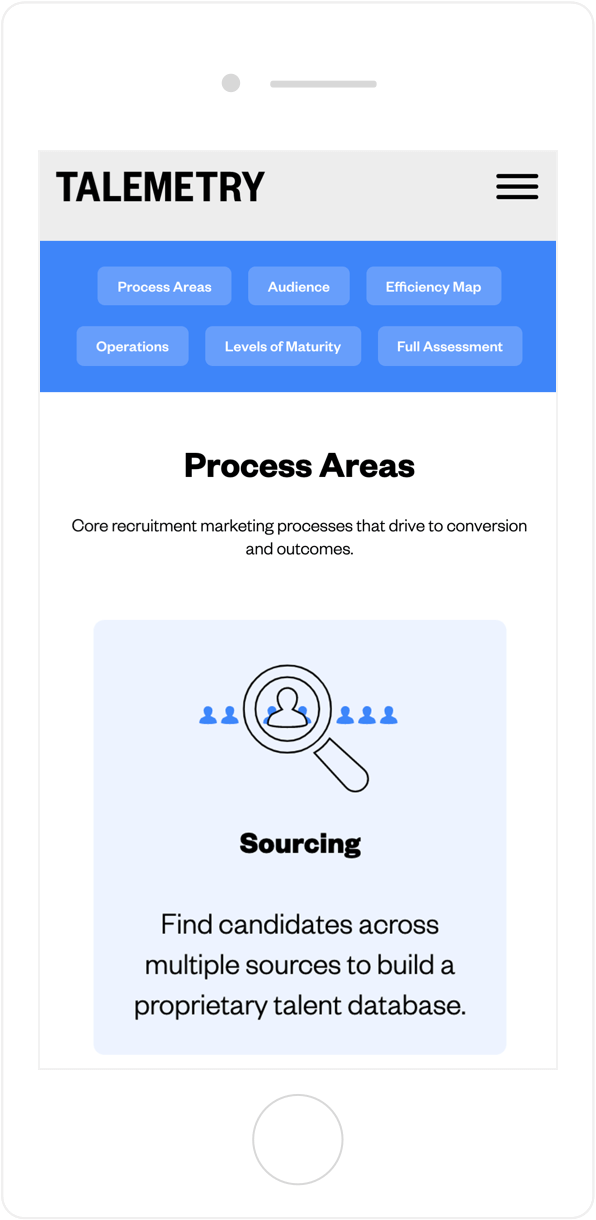
Nifty Navigation
Navigation anchors the page design for Evolve, Talemetry’s key framework, to help prospects learn more about the product as well as gaps in their recruiting processes.
Explaining with Animation
Five explainer animations highlight key benefits of the software. These were updated during the rebrand to match the new color palette and fonts.


