TransAct
Simplifying User Experience with a Bold Aesthetic and Concise, Persona-Centric Content
Background
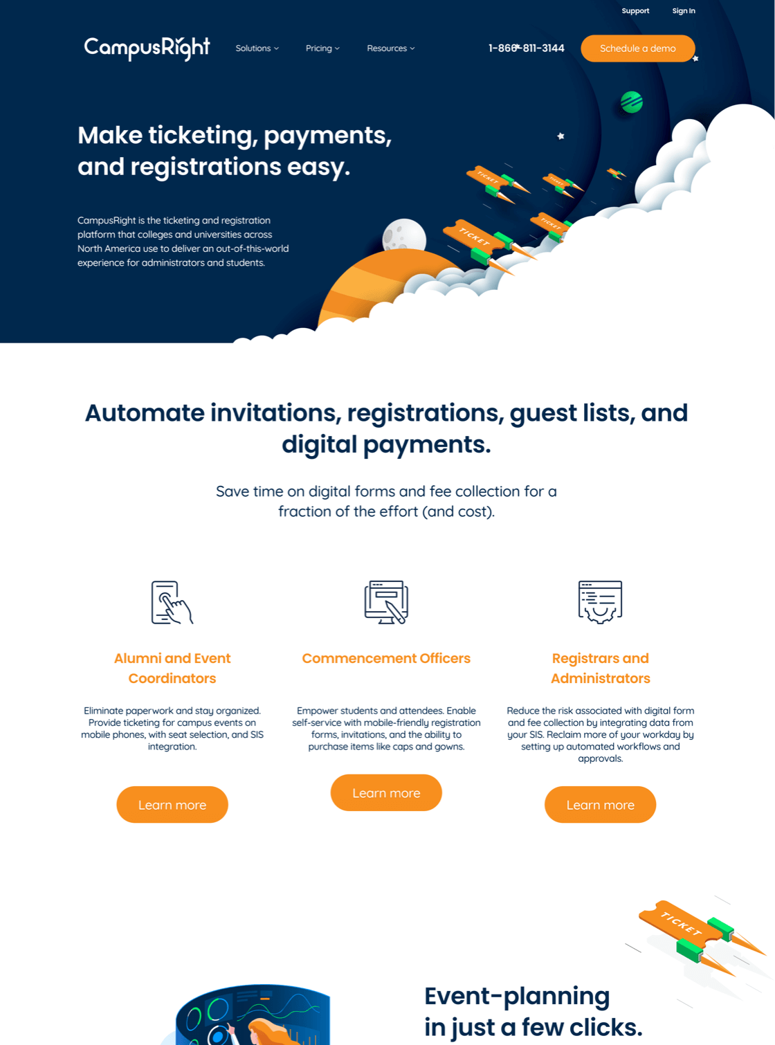
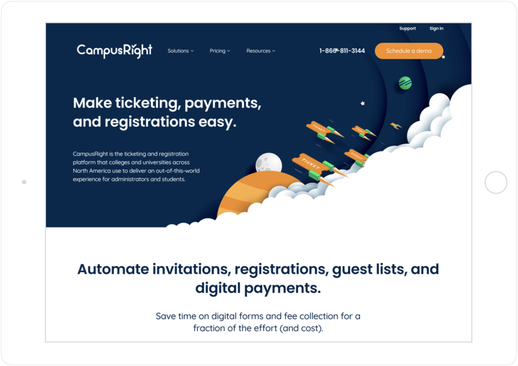
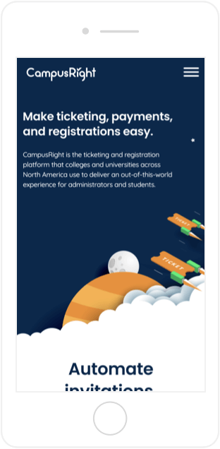
TransAct oversees a portfolio of K–12 and collegiate educational technology brands whose collective mission is to improve workflows for administrators, teachers, and parents. The organization needed to revamp—and simplify—its website for CampusRight, a ticketing and registration platform, in order to provide a better and more targeted user experience. After TransAct reached out to SmartBug Media™ for help, we crafted and built a CampusRight website—with TransAct’s buyer personas in mind—that is both functional and beautiful.

Creating Visual Impact
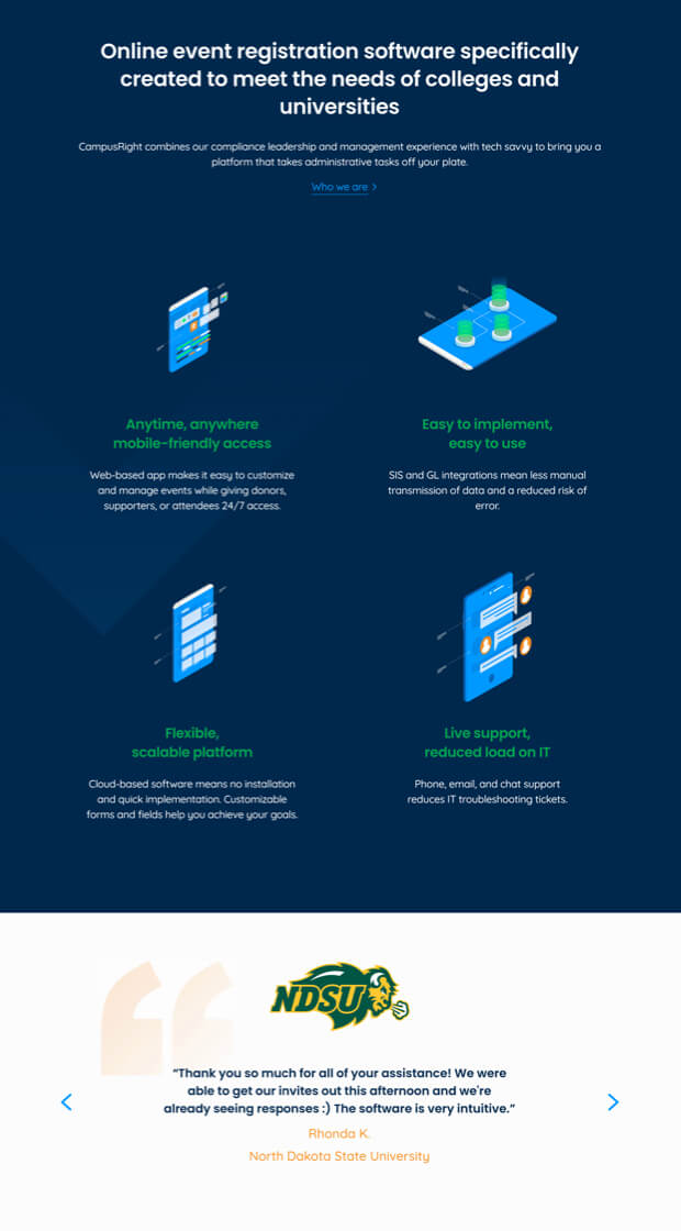
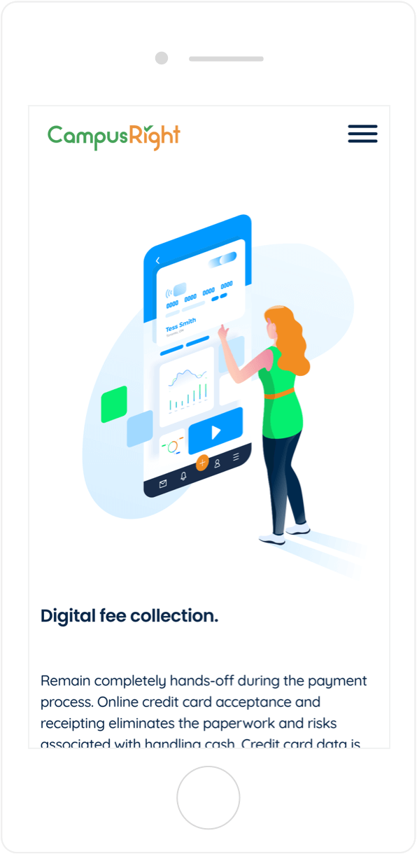
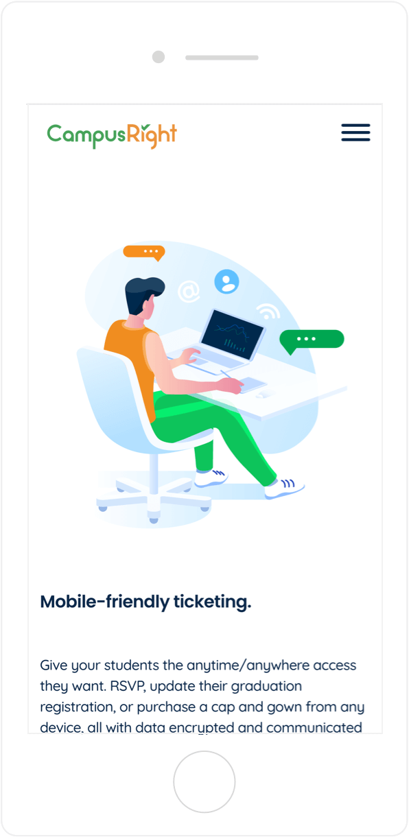
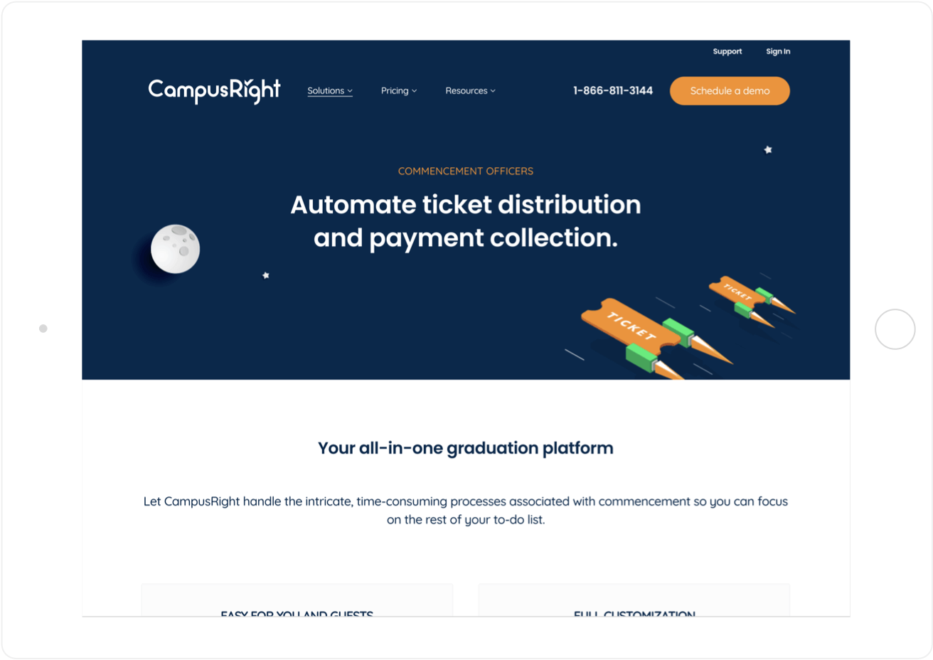
The website features stunning custom illustrations and a bold color palette that draws users in and encourages them to learn more about CampusRight.
Building Role-Based Solutions
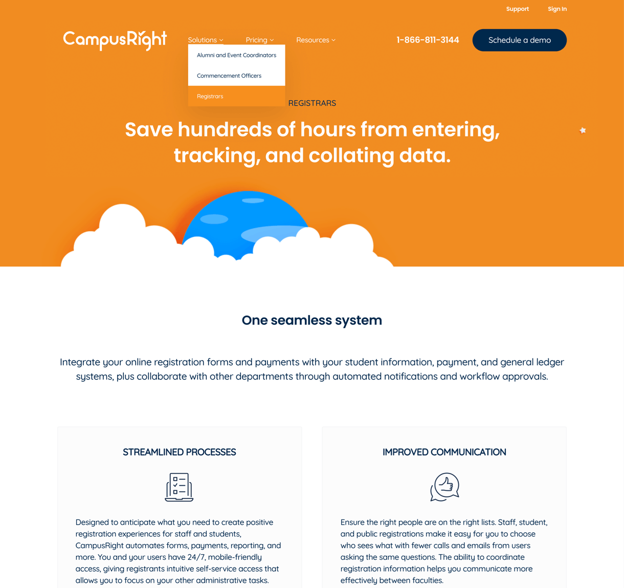
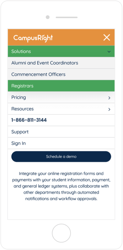
The navigation menu takes a role-based approach rather than a solution-based approach because CampusRight solves different problems for different personas.
Getting Straight to the Point
Minimal—yet meaningful—content on each page of the website lets users find the information they’re looking for quickly and easily without getting bogged down.
Simplifying the Site Architecture
By highlighting CampusRight’s value propositions and key differentiators, we simplified the site’s architecture to make lead generation easier and more efficient.

