Vartopia
Crafting a Fresh, Fun Look for a Leading B2B Software Provider


Background
Vartopia is a software provider that helps businesses improve their CRM and data management systems. With more than 30,000 partners, the company has long been helping vendors increase the value and efficiency of their tech stack. Unfortunately, their website was holding their business back. In addition to not displaying the messages the business believed in, their website wasn’t set up to generate leads, invite partners, or support the marketing campaigns their team knew they needed to grow. So we built a fun, fresh website that draws in visitors and encourages engagement.
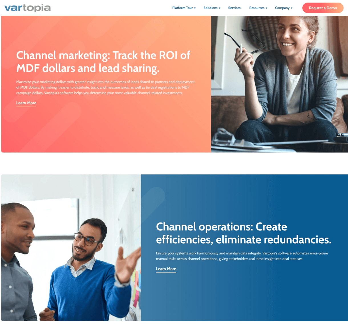

Accenting Key Messages with Color
Our design team intertwined a fresh color palette with bright accents to emphasize a fun, yet professional brand.
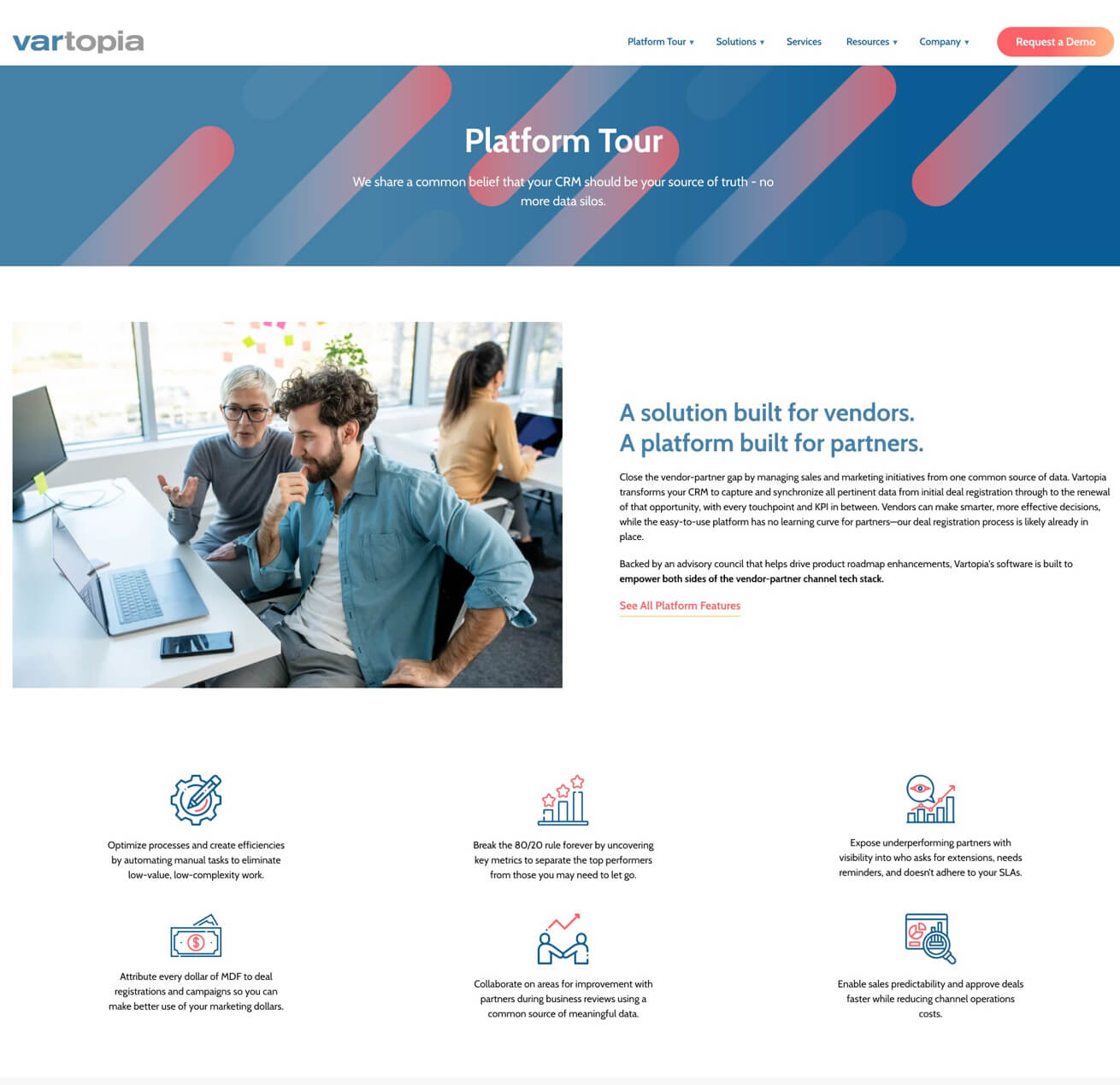
Grabbing Attention with Graphics
We crafted simple, eye-catching graphics to draw in the visitor’s eye and break down the client’s story.
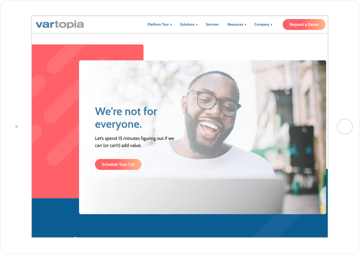
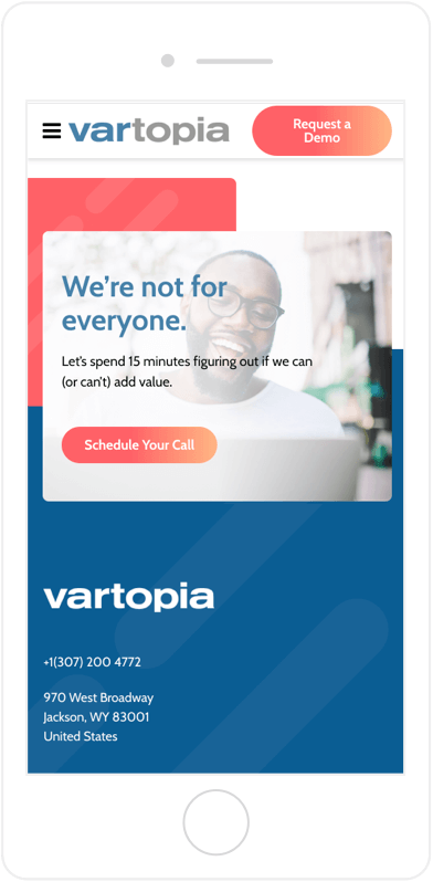
Inviting Partners with Crisp Images
To welcome new partners, our team assembled active, positive images and laid them out in a visually-inviting series.
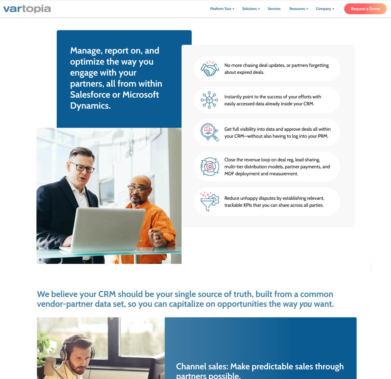
Simplifying the Complex
To keep visitors engaged, we paired a clean layout with informative, hard-hitting bites of copy.

