How to Create the Right Emotion with Color in Web Design
February 12, 2016
By Juli Durante

Does color change how we feel? That's the question that's been asked by many researches of color psychology throughout time. There are two schools of thought: some think there is a link between colors and emotions, which can have implications for your brand; others say that the precise color you choose doesn't say very much about your company, rather the consistency at which you apply your brand guidelines is key. And if you ask an anthropologist, they're likely to tell you that it's less about the actual color you choose and more about the way that color has been used in a certain color. Yikes.
As marketers, we can apply the psychology of color and some basic principles of color theory on your website to reinforce your brand, inspire visitors to take action, and create a cohesive design. Here’s how it works:
How color makes us feel about a brand
Many brands use blue as their primary identifying color: Facebook, Oreo, GE, PayPal and more. Traditionally, we've been told that blue conveys a feeling of trust and security, which is why so many brands use it. But do shoppers buy oreos because they feel secure, or do they buy Oreos in blue packaging because the recognize the brand and want delicious cookies? Would we expect subpar product to come in cookies in a red package? Probably not.
That said, color is never irrlevant. Our eyes see many hues, tints, shades, and tones, and the way they work together does have meaning. For example, a sports bar in Green Bay, Wisconsin (Home of the green-and-yellow-clad Packers) would be wise to avoid a logo and decor in blue and orange, the color of their nearly 100-year rivals, the Bears. But that blue and orange bar will do just fine in New York City. For anyone who has every taken a does of Pepto-Bismal, a particular shade of pink can stir up some serious feelings that will stop you from eating strawberry soup, although it may not hinder your mascara purchase. And while we're on the subject of pink, although we're prone to using it for "feminine" messaging today, that wasn't always the case, futher showing that the "meaning" of a color is fluid easily changed through time and space.
Combining Colors
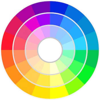
One way to take control over the way color makes use feel is to pay close attention to how we use colors in combination. Colors we see in close proximity do matter: A bright orange logo on a vivid blue backgrop is likely to hurt our eyes and make us feel a little tense or uncomfortale, because those two colors are opposits (or "complements" in color theory). When building combinations, most descriptions will reference the color wheel. As a refresher, here’s how it’s set up:

Here are some fundamental color combinations to get you started:
Monochromatic

As the name suggests, monochromatic color schemes use only one color in various shades. They may also use black and white. These color schemes quickly create a unified, cohesive look. If too many shades of the main color are used, there may not be enough contrast in your web design, and important elements such as headlines, navigation, and calls to action won’t stand out. If you're considering a monochromatic website, be sure to use a lighter or brighter version of the chosen color of those essential elements.
Complementary

Complementary colors are those that are across from each other on the color wheel, such as green and red, yellow and purple, or blue and orange. Because they are opposites, these coors can be used to create a lot of visual interest; however, they can also create visual tension and discomfort. To use complementary colors successfully in web design, consider using the opposite on the elements you want to draw attention to, such as call to action buttons, or headlines.
Split Complementary

Like complementary colors, a split complementary scheme relies on opposites to create visual interest. However, instead of direct opposites, this scheme uses a variation: the base color is accompanied by the colors to the left and right of its opposite. So a split complementary scheme can have red as a base color, then a yellow-green and blue-green as accents. This scheme can be less aggressive than a standard complementary setup but also has a chance of feeling chaotic or cluttered.
Triadic

Triadic colors are three colors that are spaced evenly around the color wheel. Red, Yellow, and Blue are triadic colors (they're also the "primary colors", from which other colors can be created). Purple, Orange, and Green are also triadic colors. Because they are very varied, triadic colors can look chaotic on web design, but they do create a lot of visual interest, which is helpful for adding interest to a design or drawing attention to a CTA.
Analogous

Analogous colors are those that are next to each other on the color wheel. An analogous scheme could be red, yellow, and orange or green, blue and purple. These color schemes have enough visual interest to create contrast but still feel cohesive and complete. In your web design, consider using a more muted tone for one of the colors with a brighter option as accents.
Applying these principles to your website
When using colors on your own website, start with some basic questions. How do you want the visitor to feel? What do you want them to do? How does your brand messaging fit in? From there, you’ll be able to start making choices about which color scheme suits you - and testing your hypothesis.

About the author
Juli Durante was formerly a team lead and marketing strategist for SmartBug Media. She has been using HubSpot and practicing inbound marketing since 2011, first as a one-woman inbound marketing team and then at SmartBug. A born and bred Jersey girl, she's a graduate of Rutgers University where she studied Anthropology, Art History, and Classics, making a very natural transition to digital marketing. Juli's education helped her learn more about research, analysis, and Jasper Johns, which she applies today when planning and measuring campaigns. She's particularly passionate about CRO and website optimization. Read more articles by Juli Durante.


